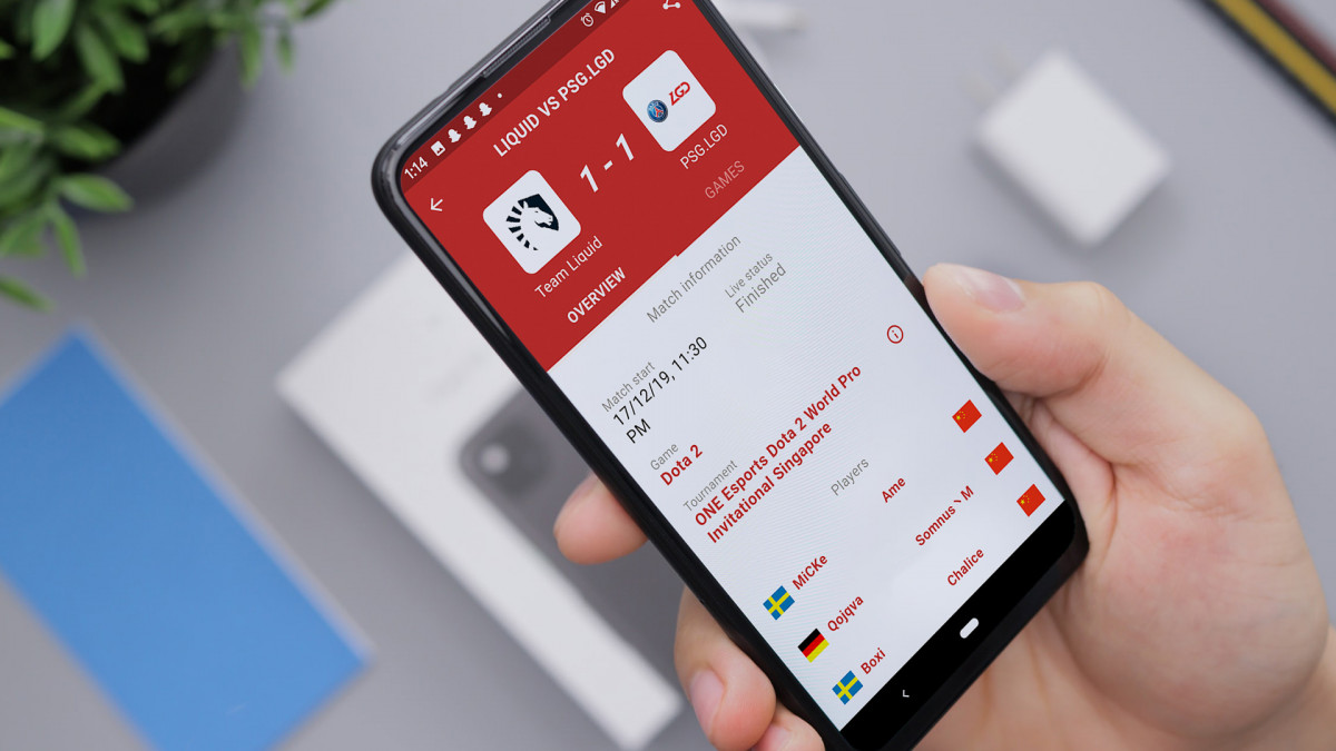
enabling fans to follow what is upcoming in esports through a schedule app based on the most popular esports wiki
role
Designer
team
Jasper Van Riet developer
Thomas Huffert developer
Radoslav Kolev coordinator
Jesse Hart coordinator
timeline
Aug 2018 – Oct 2019
tools
Adobe Illustrator, Avocode
what is it
At present, any user can track what events are upcoming in any game that Liquipedia, the most popular esports wiki. But if you are a fan of five games, that meant you needed to check all five wikis to get ahold that information.
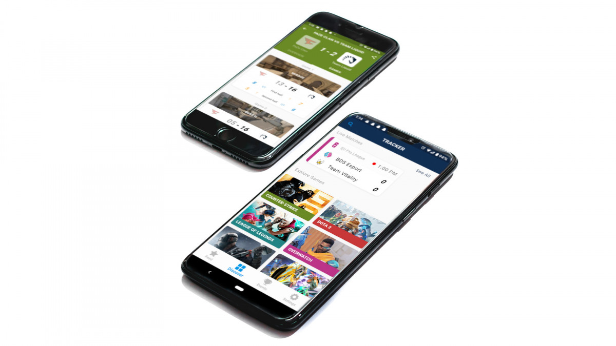
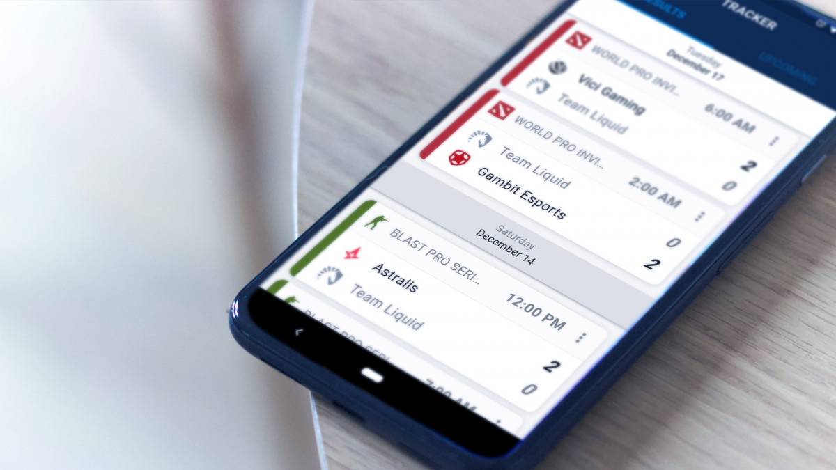
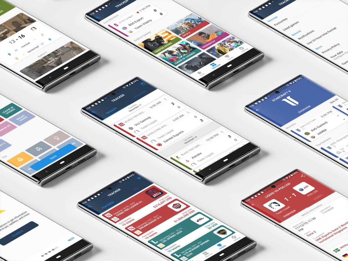
The Liquipedia Calendar App is a desktop and mobile app that allows users to easily track their favourite games. They can also filter through tournaments in the past, present, and future, look up information on a specific player or match, and be notified of ongoing events.
my role
I was the sole designer for the entire alpha build of mobile app. While my team and I worked together on research and ideation, I was tasked with designing the experiences around each key feature—favouriting games, match filtering, event discovery, match information, and much more. I defined the visual language of the platform and worked closely with the lead developer for transitions, animations, and motion in the app.
I was also responsible for preparing each design for handoff to developers. I created rough prototypes of certain user flows, and proposed to utilize Avocode for delivering pixel-perfect designs that developers can understand and use alongside a trackable changelog of updates with each new iteration.
results
While the app is still under development, the alpha testers of Liquipedia Calendar App said they were extremely happy to get notified of matches they were fans of. They also found it easy to track what events were ongoing and convenient to have the basic information they needed about each tournament at their fingertips.
this section is currently under construction
you can still read about my process, but please note that this is not fully refined and is missing documentation.
Constraints? Boy did we have a lot of those. The team worked on a timeline that unfortunately didn't include enough time for full prototyping and user testing between each design.
Here were a few of the experiences I was focused on:
- Favouriting Matches
- Discovering Events
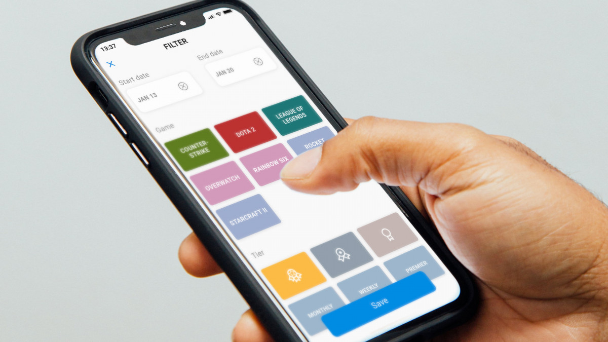
- Filtering Feed
- Looking up Match, Event, and Player Info
- & definitely more
research
I began with current market research, examining usage best practices even in apps non-endemic to the space. I then mapped out the information architecture of each feature, and how they would flow throughout the app.
wireframe
Then some wireframing. I did some prototyping. Did some refining, yet again. User journeys? I am the user. (really though, we simply did not have the resources to do prior testing)
prototype
did somma this on InvisionApp for proof of concept with developers for flow explanation, then moved onto Avocode to link together.
feedback process
Each design went straight to developers and went through a round of feedback. so many details in each user experience that I went back and re-examined. The team & I went back and forth each iteration via feedback documents on features that needed tweaking or possible new features to better support the primary ones.
visual improvisation
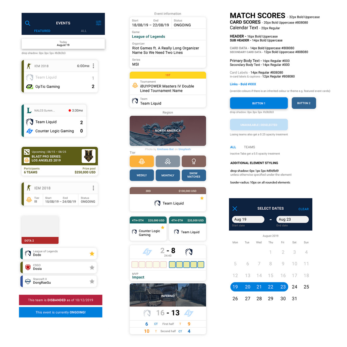
I opted for a card-based design as I found it convenient to colour-code and keep consistent as a fundamental element throughout the app. bad idea now that i look back at it. it looks so cramped. why did i say yes to dropshadow when i could've just used colour & shape with better spacing? no wonder i struggled with information bro
further improvements
I learned a lot about UX copy, and how much I wish I didn't do all of this aloney on my owny. The makeshift process gave extremely valuable experience that forced me to look at all aspects of product design. I really wish i documented more about the why of my design decisions!
Many parts of this project can be vastly improved—I would've loved to try more user testing, more time to really refine the visual style of the app, and try a different program to design these screens, because illustrator was not the move (figma is my new boo).
A senior ux designer will likely take over the project with these designs as base to improve on, so all this work was not in vain : )
say hi anytime at collaborate@tiff.pw