
shoutout Matt for breathing motion into my work
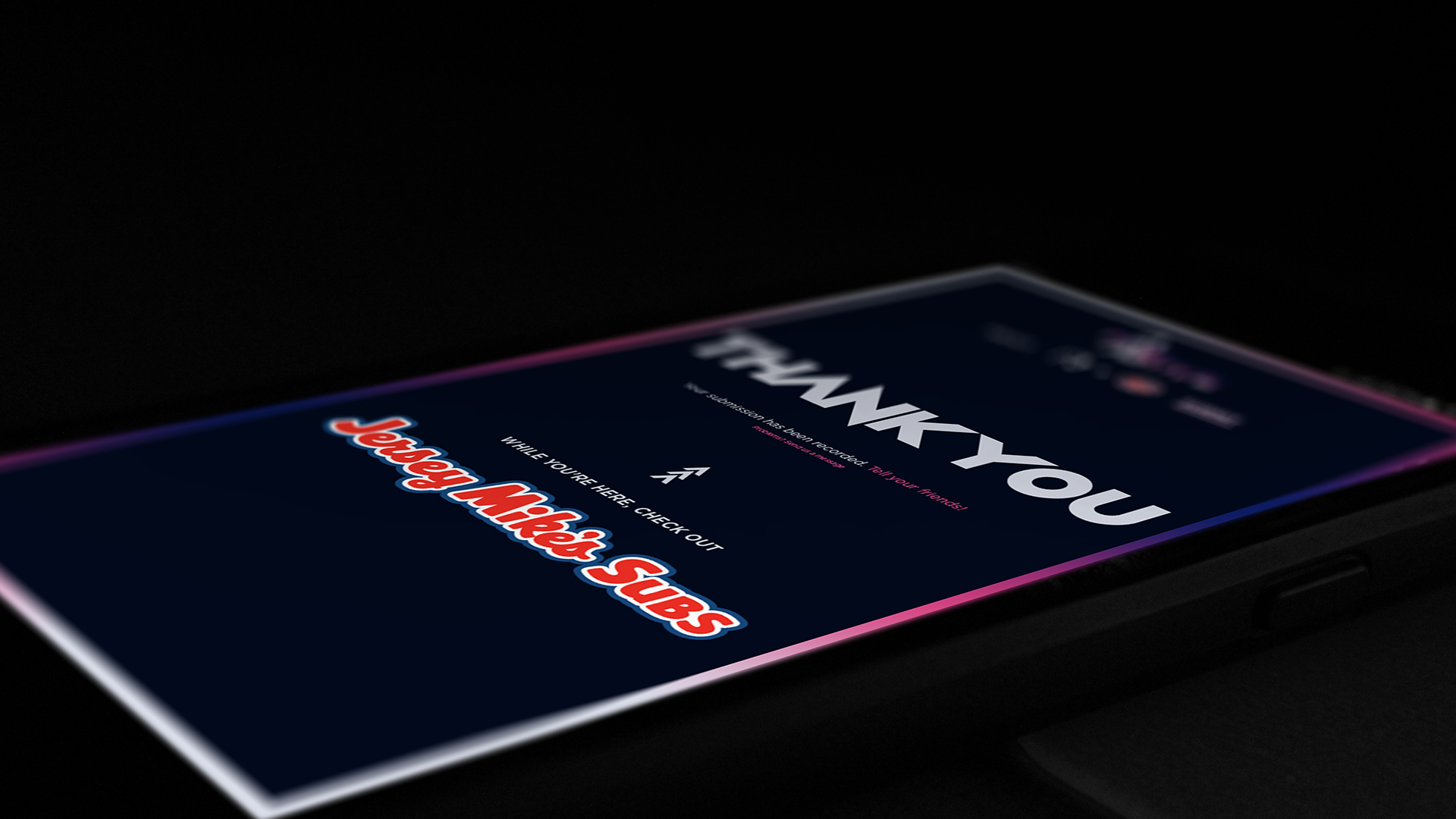
We teamed with Jersey Mike's Subs in an exclusive co-branded campaign to search for Team Liquid's biggest fan.
role
Lead designer, Art Direction
team
Matt Eriks motion design
Felix Temple production
Xiem Vuong developer
Partnerships Dept coordination
& me
timeline
30 weeks
tools
Adobe Photoshop
what is it
In partnership with Jersey Mikes, the renowned esports team Team Liquid (TL) set out on a two month long campaign to discover the greatest TL Fan ever. A loud one who first shouts in the crowd, a kind one who endlessly supports the team, a fervent one who follows our path to the end—a fan above.
approach
I was the lead designer that directed the theme of the campaign. I developed the campaign logo and visual language of supporting graphic assets, from ads to a website. A fan above is truly unique, and is the one that stands out among the rest, so bringing the fan into the spotlight was essential to the development of the design. The primary imagery of this theme frames an unknown figure instead of the specific individual, giving the connotation that the potential Fan Above can be you—you could fill that silhouette and be in the spotlight, taking the glory as the biggest Team Liquid fan.
successes
The campaign gathered nearly 80 submissions in total from our fans, and reached even non-gamer communities on social media. Because the visual guidelines were so clear, our team had no issue creating new marketing materials. Our team and partners were satisfied, and our winner also experienced three day curated experience of the life of a pro gamer.
moodboards
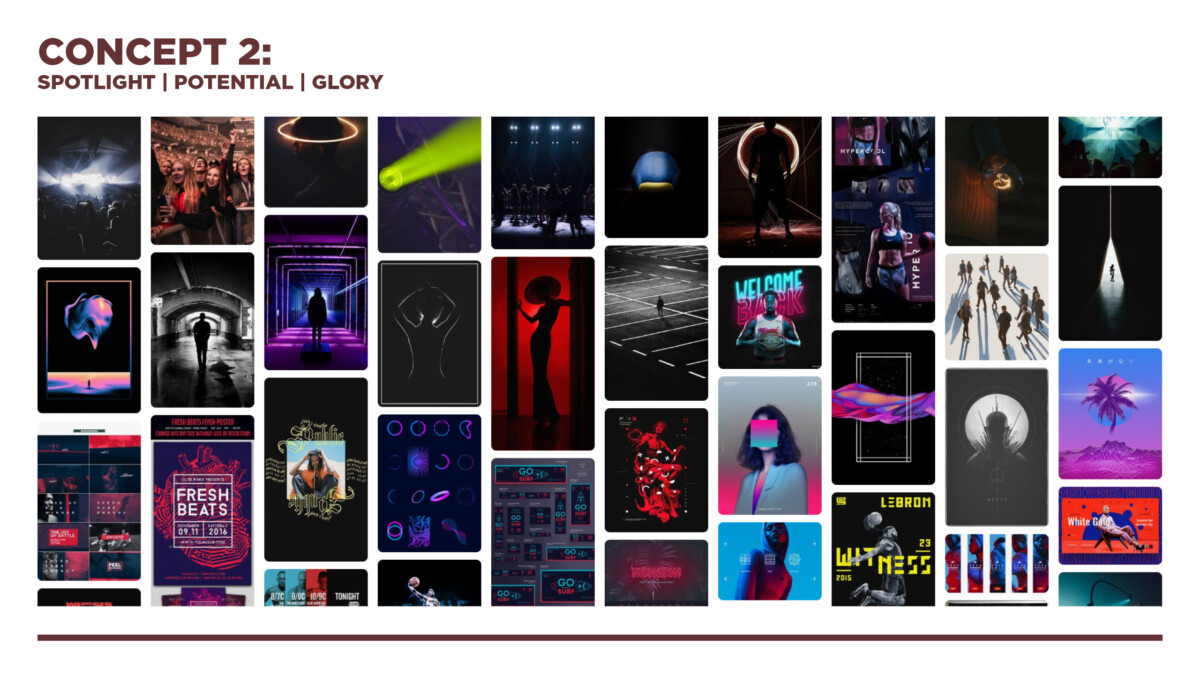
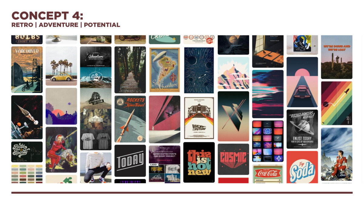
Researched & developed moodboards, and then presented them to Jersey Mike's partnership coordinator for approval. My approach was to use primary keywords as an anchor to the theme at hand.
logo sketches
Here's some cool sketches.
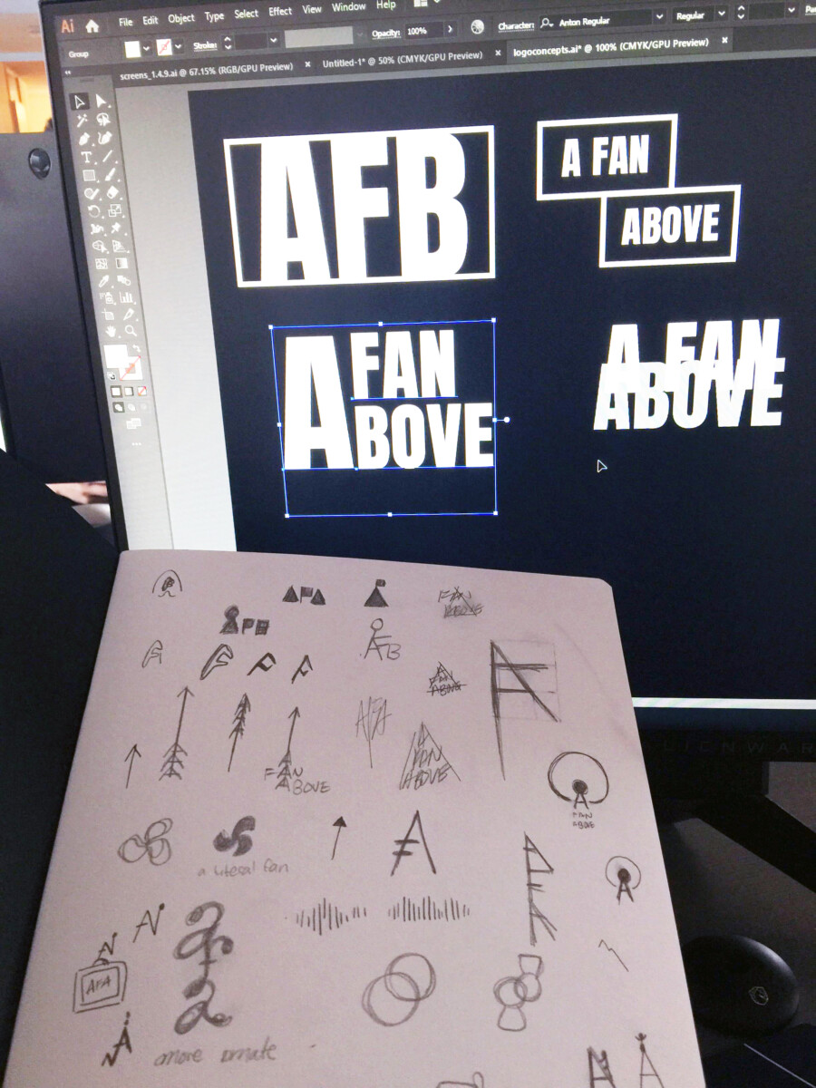
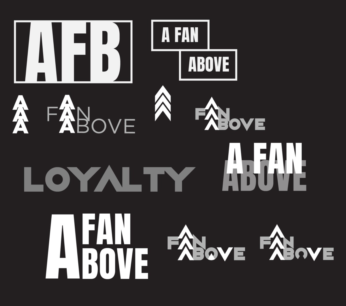
then i knocked out and woke up to a really cool logo concept
visual development
Final logo very purposefully uses chevrons & a silhouette in the O to denote the spotlight on the fan. Sharp type used to match the energy of the dark, edgy tone noted in the moodboard.
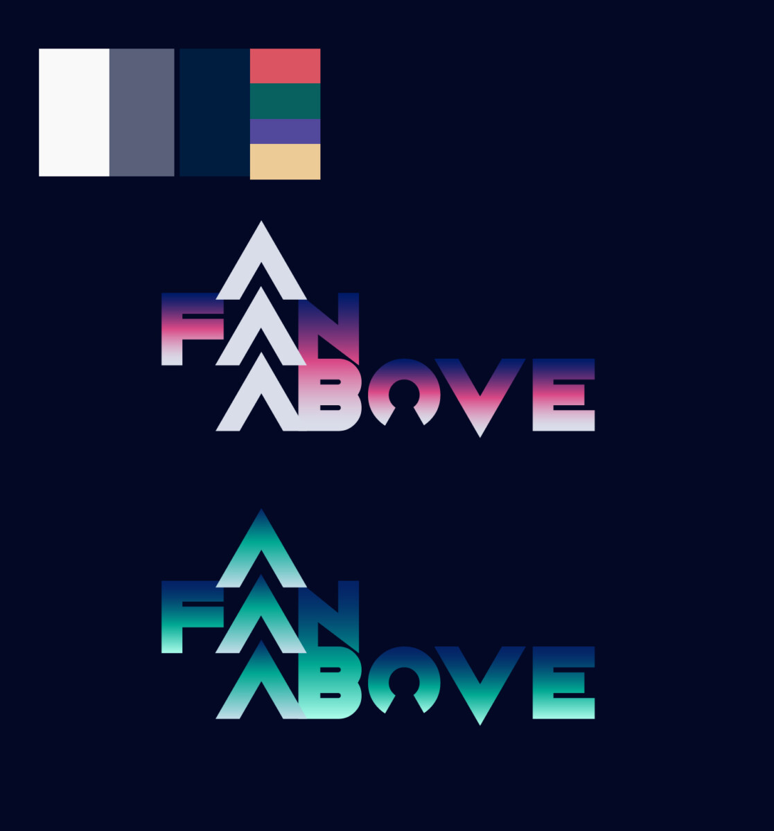
Damn that blue one kinda sweet tho.
Anyways colours are used in a gradient to highlight a glowing spotlight to the overall look. A dark midnight blue background is used instead of pure black to mimic a more natural palette—there are no true black colors in nature. Same is true for the off-white choice. The pink and blue colors compliment each other. pink is associated with love and passion, while blue is associated with trust, loyalty, and integrity. These are colors that represent A Fan Above.
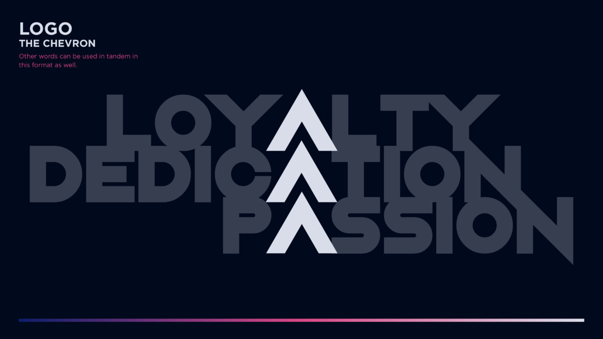
The Chevrons are an essential part of the visual language.
- TRIPLE-A: top notch, high quality, above the rest
- Callback to Team Liquid chevron use
- Recognizable at large & small sizes
They remain a solid color to maintain contrast against supporting text, and thus easily recognized as a design element when
standing by itself.
The primary elements to each graphic then works as follows: chevrons to direct & lead the eye to the main focus, a gradient border for graphic consistency & framing the vision, and glowing polygons to emphasize and spotlight figures in the crowd.
photography direction/use
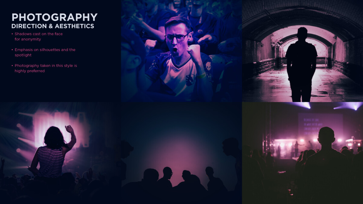
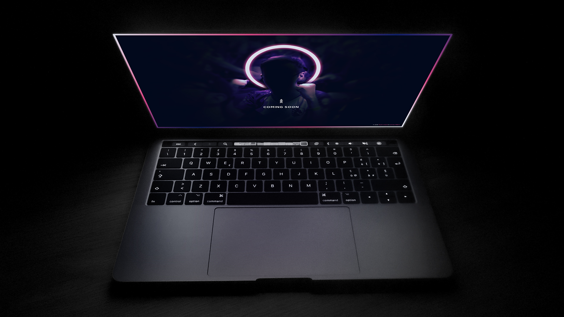
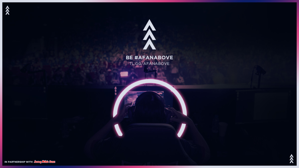
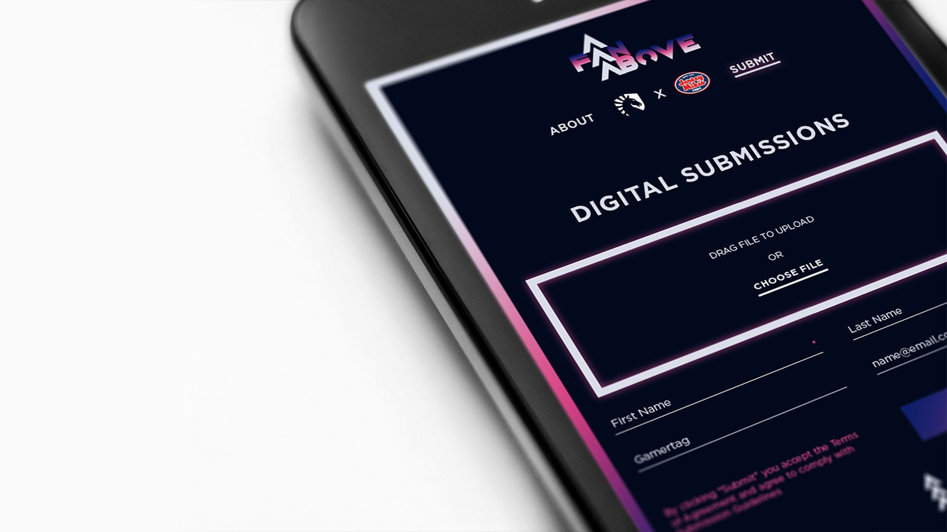
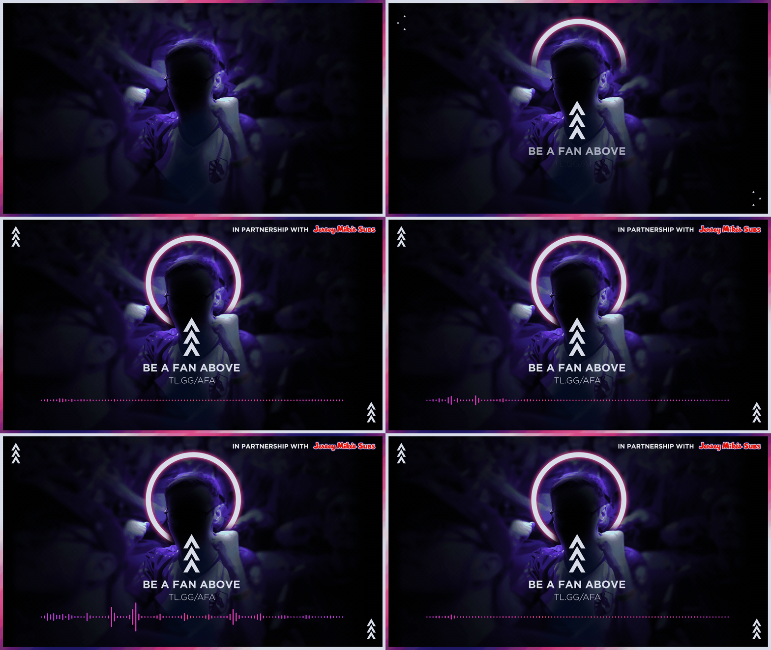
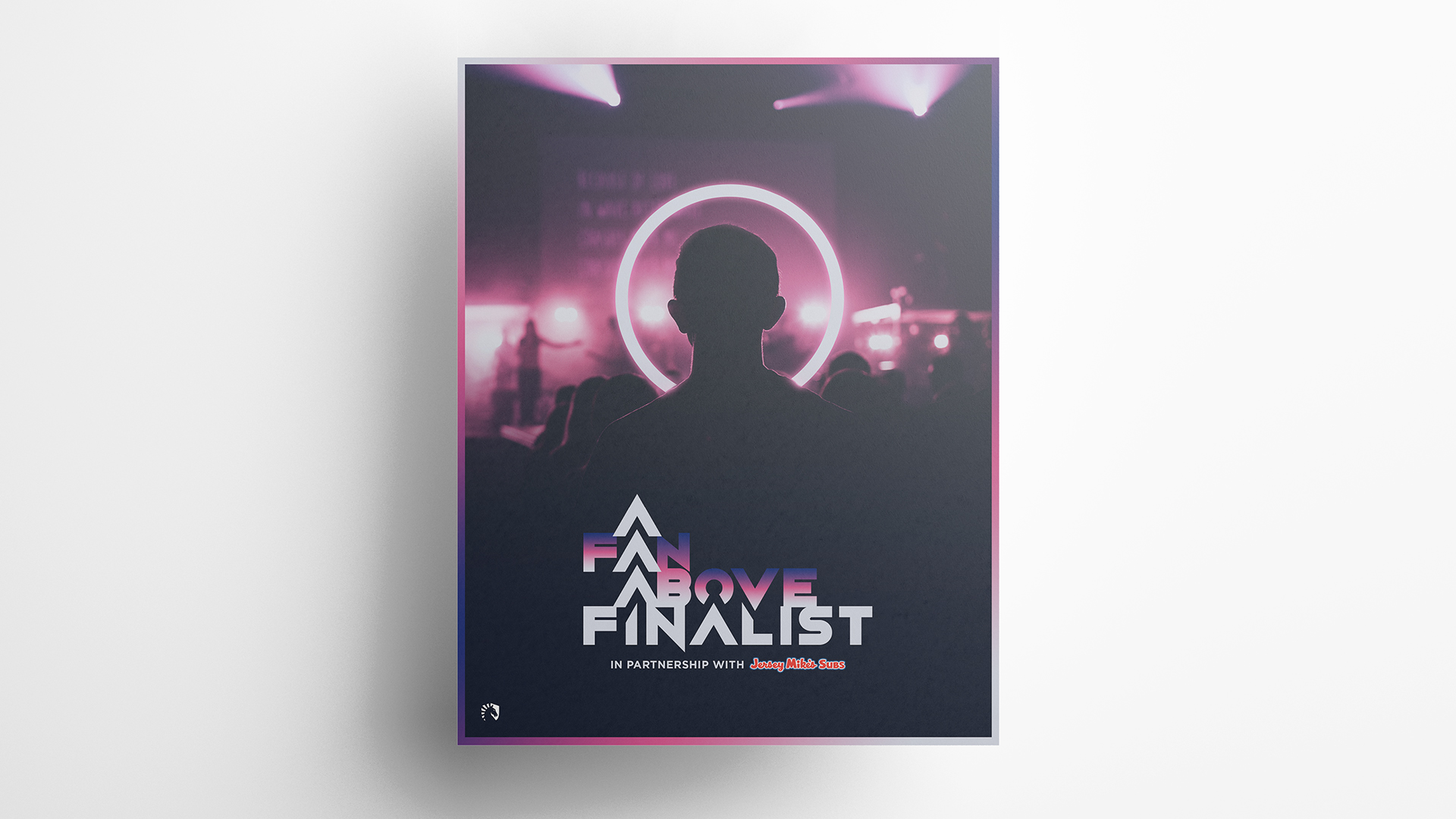
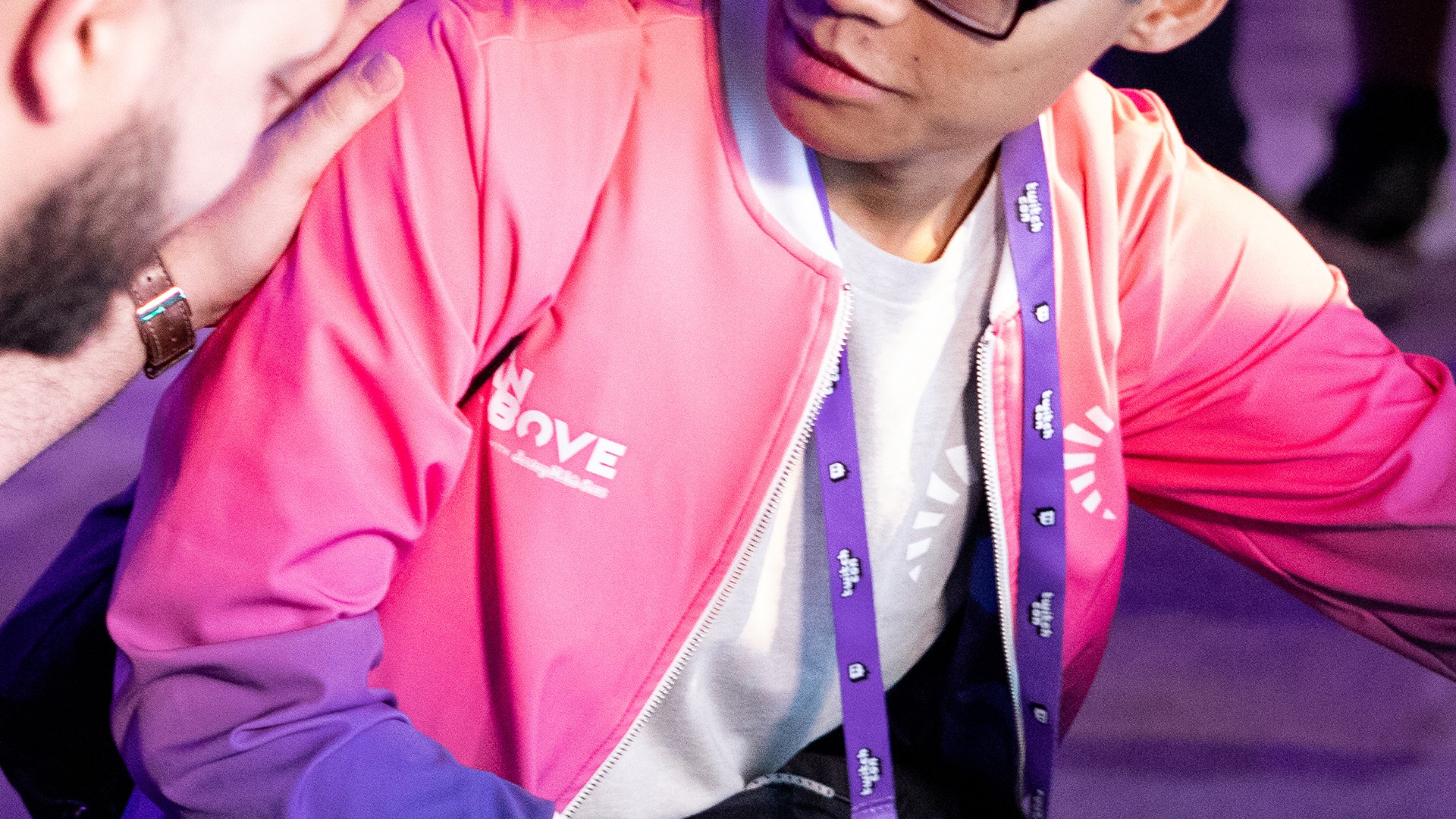
Photo: Chris Betancourt
say hi anytime at collaborate@tiff.pw