-
Week 1
sept 13topic introduced
-
Week 2
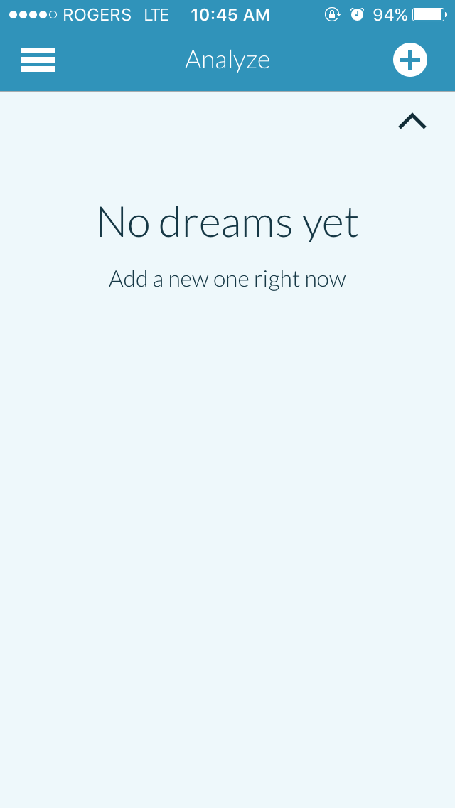
an app analysis on Medium, Dreamboard, and Dream Journal UltimateMedium
Medium is an app that serves as an open publishing platform for people to share their ideas, thoughts, news, and stories to others; a place where everyone has a story to share and the best ones are delivered right to you.” Their audience doesn’t really appear to have a set age group, although young to middle aged adults appear the most. They are avid writers/readers. These are people who have access to the internet and are interested in new stories every day. This app is used not only to explore and read about topics of interest, but also to keep up to date with current events and serve as a platform for the community to express their opinion and ideas. People can follow authors and bookmark articles they like, and anything can be published by anyone, which allows even the average person to share a great story to the world.
The look of the app is very clean and consists of two main colours, white and green. The limited palette of colours makes the app effective in highlighting important features and links, encouraging users to interact with them. Medium appears to follow the native OS style closely with its minimal, rounded icons and typography. Buttons, tabs, and other elements such as the search bar also mimic the native OS. The hierarchy of type is very easy to follow, and there are very little that clash together. Even the diversity of header images are adjusted to fit the screen.

Navigating the app appears to be very learnable because the UI is so similar to the native OS’s. If there’s more to read, scroll. If there’s a “read more” button, tap and read. If the user wants to return to the previous page, a back button is available at the top-left of the screen. The reverse is also true; if the user wants to move forward, there would be a button at the top-right. This structure is subtle yet intuitive, as it plays off the frequent user’s mental model of how to traditionally navigate things. The bottom menu is also easy to follow as each icon accurately represents what it navigates to.

The interface is super easy to use, in the way that if a user taps on a link, they will get what they were expecting without any surprises. The UI also assists the user to actually be able to read what interests them, which is one of their goals. For example, for a reader looking to kill a short amount of time while on their commute, showing recommended articles as well as the time it takes to read an article is great. Usually, comments and replies to an article ends up out of order and hard to follow, but Medium’s collation of replies make it a snap to go through, or a snap to skip. For writers, the app’s description means exactly what it says. “Our easy-to-use tools make sure all your work looks great. It’s simple to integrate photos, audio, and video. And our publishing tools allow you to write once, share anywhere.” (source)
Dreamboard
Dreamboard is an app that allows the user to record their dreams in the most reproducible, consistent and detailed manner possible.” It’s personal tracker for those who want to remember their dreams and analyze them as a whole over time, for fun or for self-discovery. Since most dream recorders focus mainly on recording through a text editor, this app uses a variety of categorized text fields and icons to help track dreams in deeper detail, and then visualizes it in a similar way that a sports app would (through graphs, numbers, and keywords).
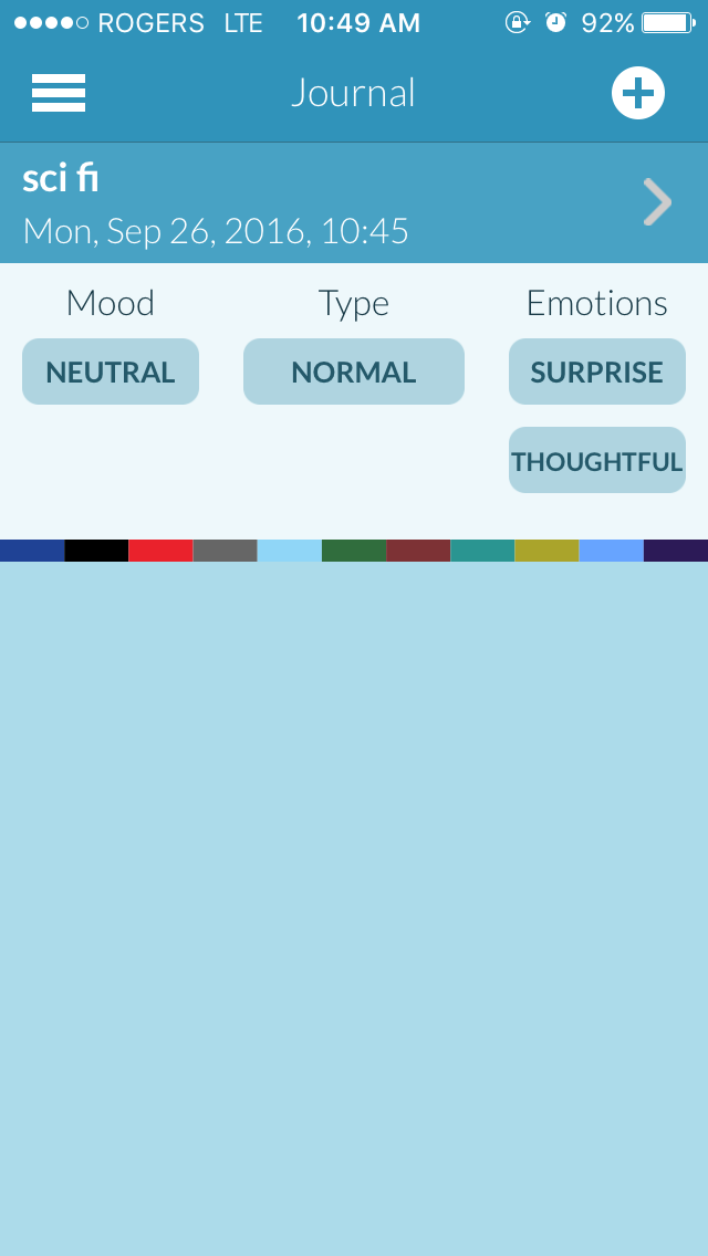
The app sports a casual, maybe almost childish appearance. It doesn’t follow the standard look for the native OS, but the visuals actually separate into two different colour schemes: a lighter blue palette during the day, and a much darker blue/black palette during the night, making it easier on the eyes should someone decide to use this app in the middle of the night. It uses sans-serif type only, and makes use of bolded text for emphasis or selection, which makes differentiation very clear for the user. Some text I would say would also be too different, in comparison. The layout of the app doesn’t seem to be difficult to follow, as there are small indicators that push the user to where they need to go. Some other graphics are inconsistent however, since some elements seem to follow a bold outlined look while others are filled in. In addition, the use of colour to differentiate different elements clash with the main blue palette. Some elements also feel too big, such as the menu (iconography and space-wise) and the headers (heavy and takes up space).
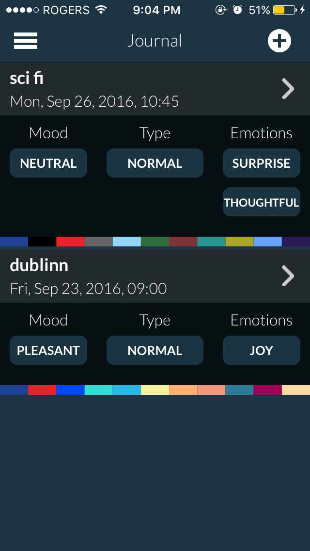
Dreamboard isn’t hard to navigate in terms of sequencing and structure, regardless of how inconsistent some graphic elements are. For example, adding a new entry can be easily found at the top right, which is frequent in many other applications. The hamburger menu on the top-left is always accessible no matter what screen you’re in, making it very easily to jump to other screens when necessary. However, I would say that navigation could be simplified even further, since there really is only two main features (recording and tracking) that the user would want to use. The only major gripe I have is when you navigate to the actual journal entries. I find it very difficult to go through different entries, since there aren’t any very clear separating indicators and entries can get lost with no easy way to find them (see third image for reference).
First off, the app occasionally freezes and crashes when navigating through the screens—I feel that a major reason for this is that the visual appearance of the app takes too much to load, which results in lag/freezing. Overall, Dreamboard isn’t terrible to use and still fulfils its goals in its UI, but there are a lot that could be changed to make it less of a hassle to go through. The app consists of mostly tap and scroll interactions, which isn’t bad but some definitely could be automated or optimized. For example, the ability to switch between entries using swiping motions should be implemented since there are no other links, and adding content in free text fields (think “tags”) should bring up previously used content. Lots of elements feel too big and results in a lot of unnecessary scrolling, which I feel like could deter me from wanting to go through my entries in the first place, therefore ruining the intended goal of the app.
Dream Journal Ultimate
Dream Journal Ultimate (DJU) is another platform that lets the user keep track of their dreams. Unlike dream, it stores entries in a secure digital cloud if the user wants to, and allows easy sharing of dreams between people. Dreamers who like to share their dreams with others and/or read about other dreams would easily be able to find and comment on other shared dreams through the “Dream Wall.” It also has a “reality check” feature which is essentially an alarm to wake the user up from a dream.


This app is extremely minimal and has no distinctive look. Black and greys are used throughout the app, with iOS’s blue to highlight specific elements such as the icon on the bottom menu when on corresponding screen. The toggle buttons, iconography and typography are also visually the same as the iOS. Even menus that pop up don’t have its own specific style (e.g. “sort” pulls up a visually standard iOS menu). When composing a new entry, some toggles appear too large, while the date of the entry appears too small. Everything looks squished together, and there are no distinctions between the header “dream description” and the type inside the box. The keyboard unfortunately also obstructs the text at first unless the user scrolls downward again. Generally, the app looks good at first in its minimal aesthetic but it gets too simplistic and several elements end up hidden or doesn’t fit with the rest of the look.
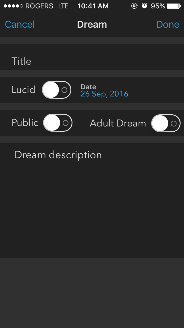
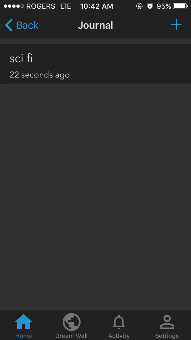
DJU isn’t hard to go through either as the bottom menu serves its function pretty well, but there are key features of the app that are hidden away and can’t be accessed unless the user performs a specific task. Of course, the navigation is still memorable, but basically the sequencing of features feels displaced. For example, to like or comment on another dream requires you to have an account, but if you didn’t sign up for one the first time you opened the app, it’s literally impossible to find anything that says “create an account” unless you indirectly try to comment on something; only then does it prompts for an account creation. Another thing is that “home” shows four options, three of which feels unnecessary (reality check, dream journal, add dream, invite friends). These could be easily sorted elsewhere or melded together, and would allow the user to actually be able to see their dream entries before adding a new one. Having a homepage with these options just feel like extra work navigating to where I want to be. Browsing the “Dream Wall” isn’t difficult, but should I try to navigate to a certain time or want to see something new, there is no indicator when a date changes.
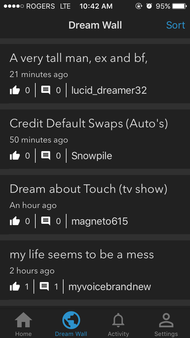


Because the interface is so blatantly simple, in essence the app does exactly what it intends to: record and share dreams easily. Despite the sub-par sequencing of the app, it’s very easy to use and even easier for users to share their dreams. Having one screen dedicated for other people’s dreams makes it effortless to read about them, and dreams that are the “most liked” can be sorted to see which dreams people liked reading about. However, if the user wants to read someone else’s dream that they liked previously again, it’s impossible to find as there is no bookmark system, which personally bums me out since I enjoy re-reading favourite stories. Trying to sort through your own entries is also difficult, since nothing is categorized. This is also extra painful since they provide the option to mark a dream as “adult,” but give no indication anywhere else whether or not a dream is “adult” or not in both your entries and on the Dream Wall. Like Dreamboard, DJU does what it intends to do at its core, but can be done much better, visually and structurally.
-
Week 3
the Design Brief (check week 2 for app analysis)Problem:
There are many dream recording applications out there, but most of them are purely for individual use, and almost none of them allows the user to share them with others in a unique and easy to understand way. Entries are usually uncategorized, making it harder for the user to search for past entries, and most people don’t care to read walls of text.
Solution:
Design a dream recording application that not only allows the user to easily keep track of their dream logs but also enable them to share their dreams with other dreamers in a unique and succinct way.
Value:
Most dream trackers are designed for the individual user to log longer and more detailed dreams, usually in the form of text. With this app, anyone can record their dreams for fun and generate unique visuals associated with their entries to share with other people, making it easier for others get a feel for the user’s dreams at a glance before choosing to read more in detail.
Objectives:
• Be easy to use for all ages, especially teens to young adults
• Allow users to store and track their dreams through prompted questions and free text fields
• Generate unique visuals based on entries
• Categorize dreams by type & date for easier sorting/searching
• Allow users to share their dreams with others in a succinct way
• Be visually sophisticated & easy on the eyes
• Have visual clarity & consistency
• Enjoyable to use for fun
-
Week 4
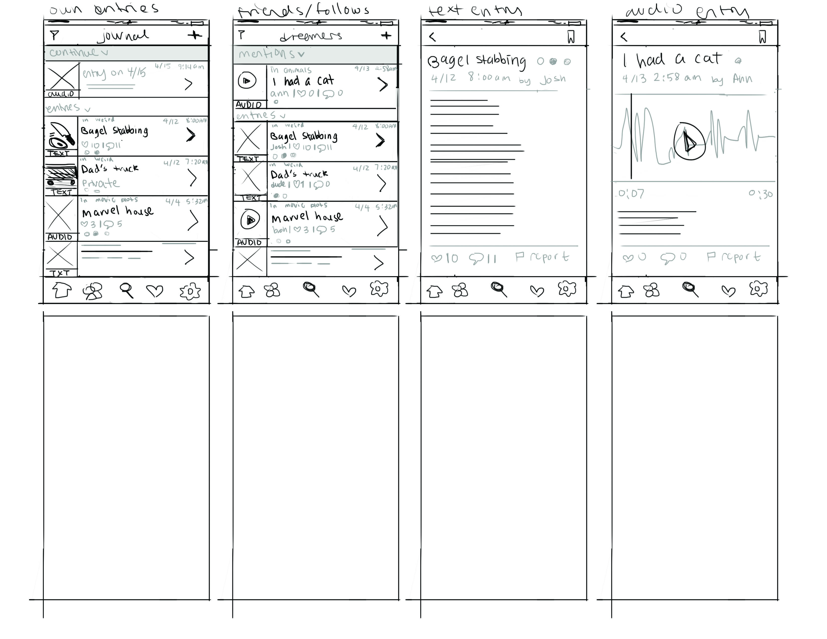
Initial Wireframes
-
Week 5
Finalized Wireframes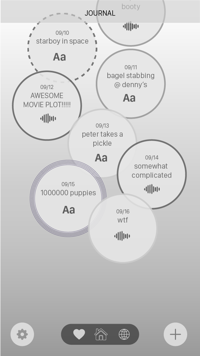

Here are iterations for the main screen exploring different navigational systems.
• The first one features more of a tab bar-like nav
• The second is a hamburger
• and the third is a flyout menu.
Overall, I tried to focus on creating a more playful, "dream-like" UI as last week looked a bit too rigid for the nature of the app. Types of dreams, such as nightmares or lucid dreams, can be identified by the border of the "dream bubble" e.g. dark solid border for memorable dreams, dotted light border for vague dreams.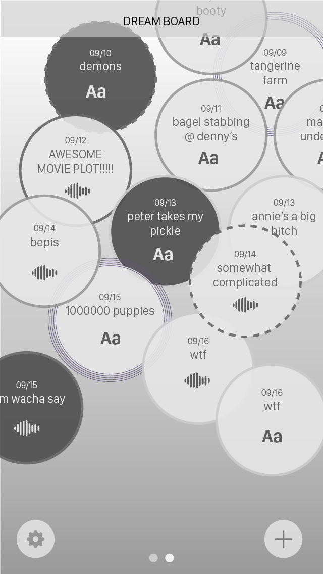
These are screens for exploring other people's dreams, as well as what an entry would look like upon viewing them, in audio and text. Users can clearly identify which entries are text and which entries are audio-based on view.
Tapping and holding a "bubble" would reveal the amount of likes and comments the dream has when exploring the dream board. Users can like or comment on a dream entry.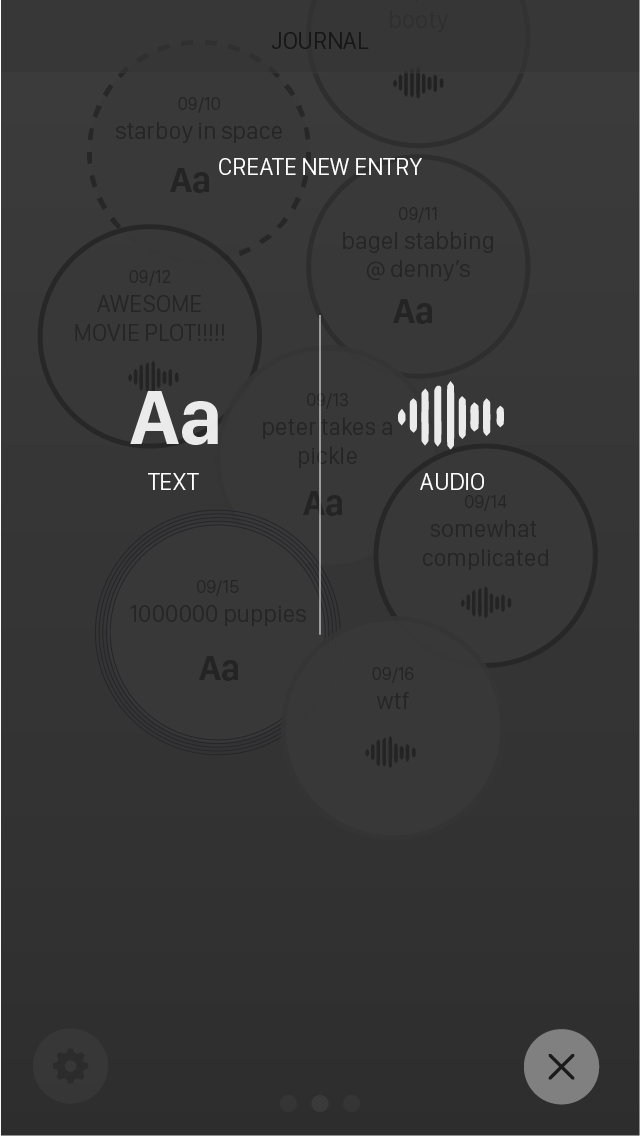
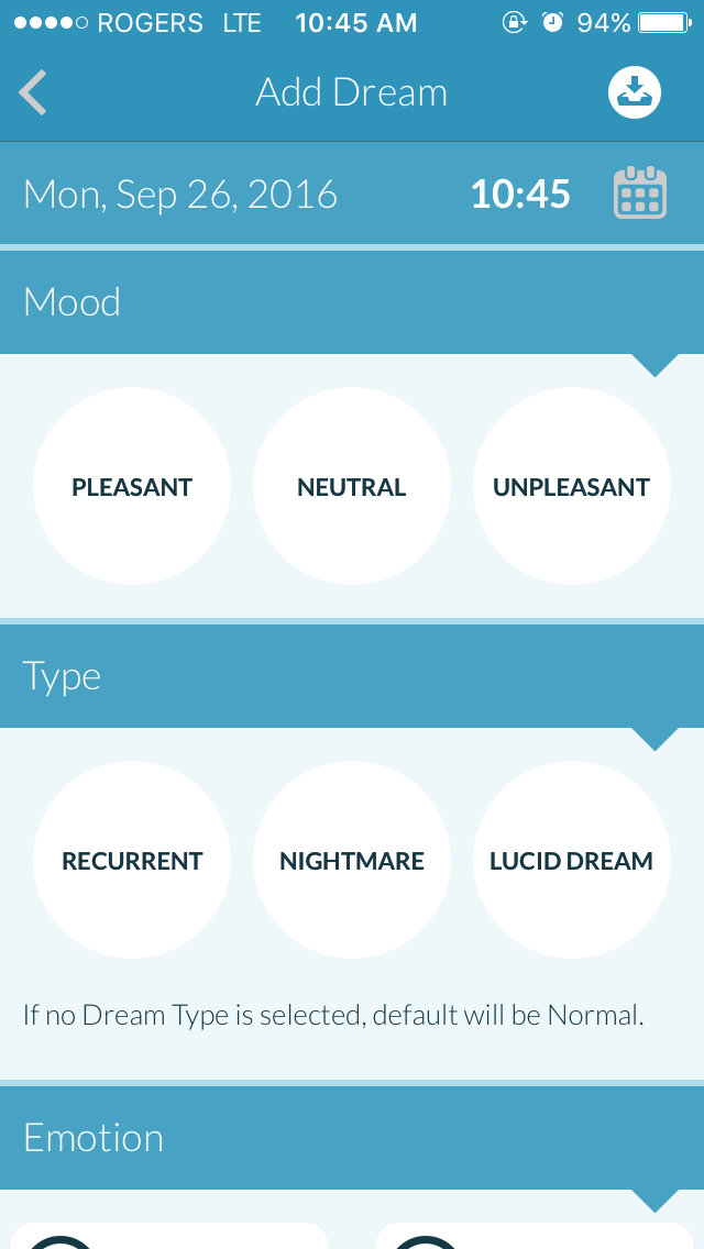
These are screens that demonstrate the user creating/adding an entry. I was considering whether or not the user should choose beforehand what kind of entry they want to post before proceeding, or allow them to just get to it and have both options available if they want to record an entry in a different format.
Last but not least, I added an alarm clock feature for the user as a prompt to use the app to record their dreams more efficently, rather than navigating to the app manually after waking (this alarm clock format is referenced from an app called Pillow).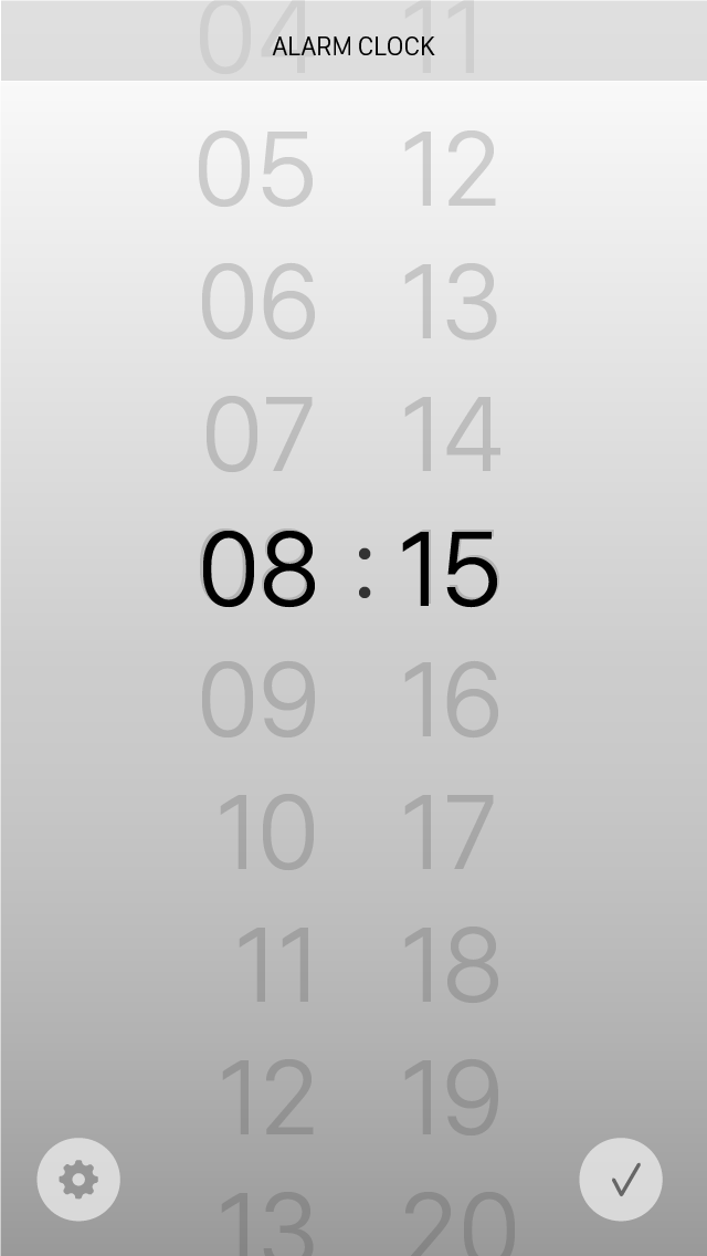
-
Week 6
Click through screens -
Week 7
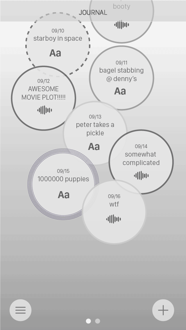
Further refinementsJournal screens
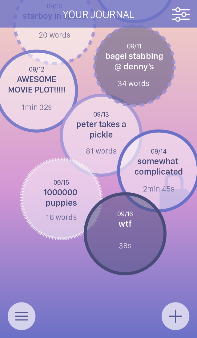
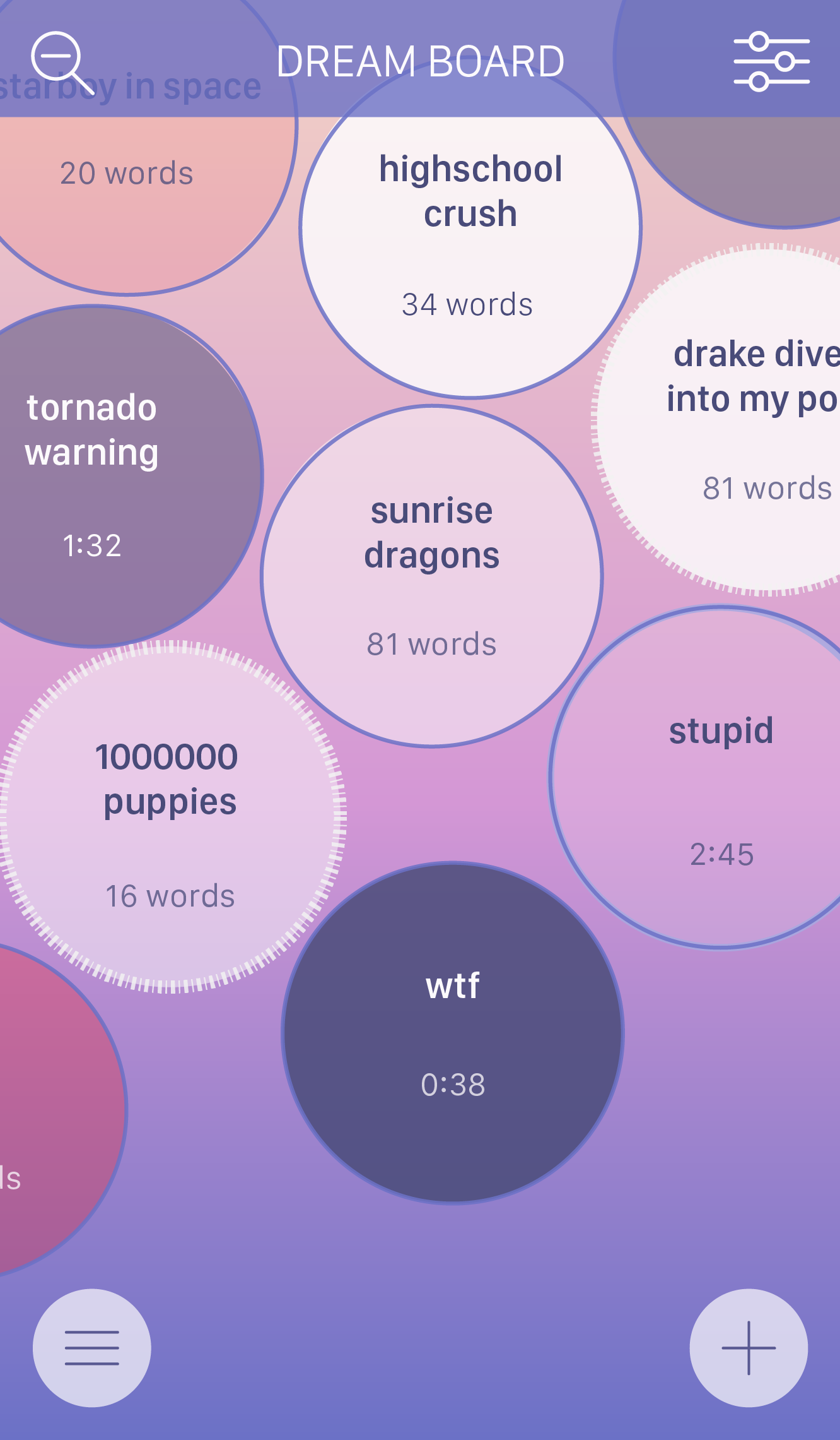
These screens are the main screens for looking at dream entries. I tried to use the borders of the bubbles to indicate how strong of an impression the dream had, and the colour as a type of dream. However, it caused a visual clash and every bubble looked too different.
There was also the issue of why all the bubbles are touching: it may look like there is a link between every bubble even though that may not be the case. I also wanted to show how popular a dream was by tapping and view an actual entry by double tapping, but it didn't seem intuitive.
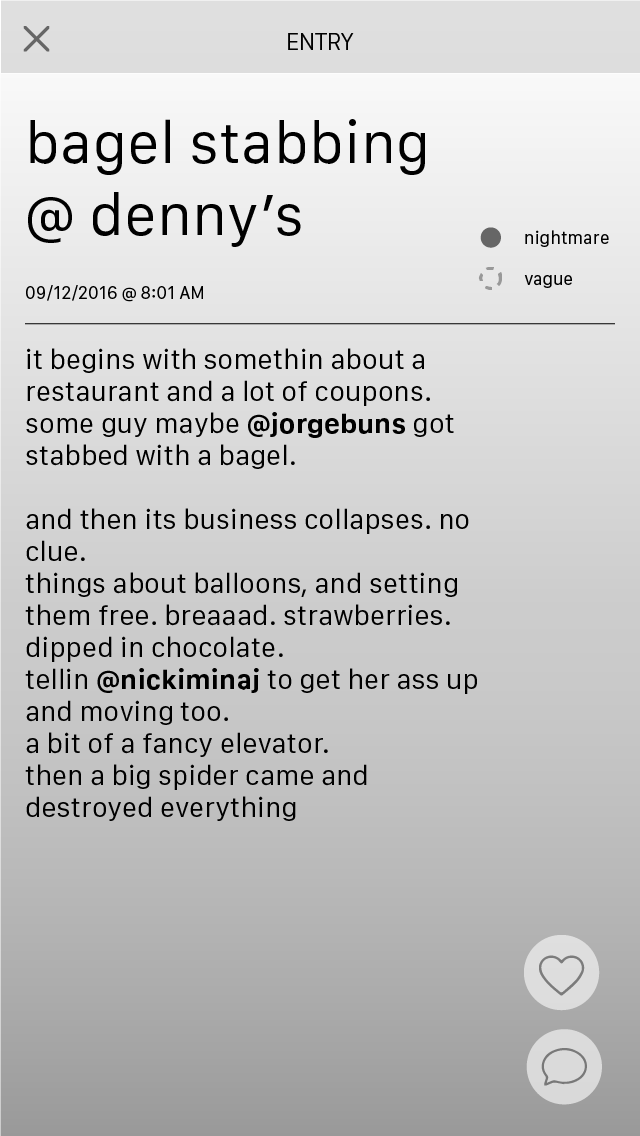
Entry screens
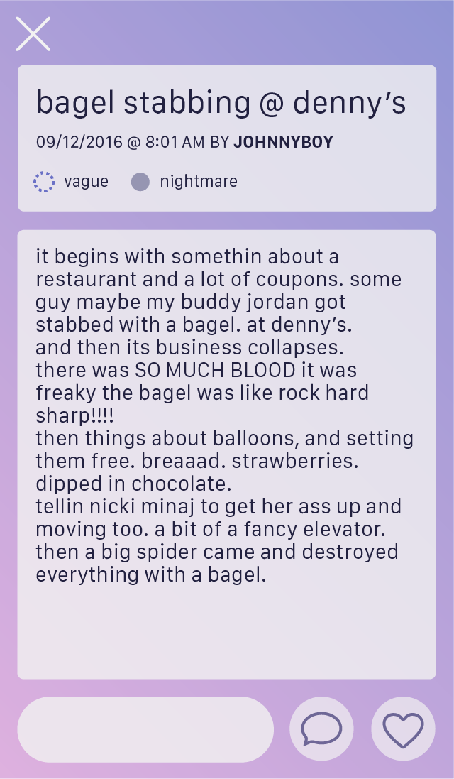
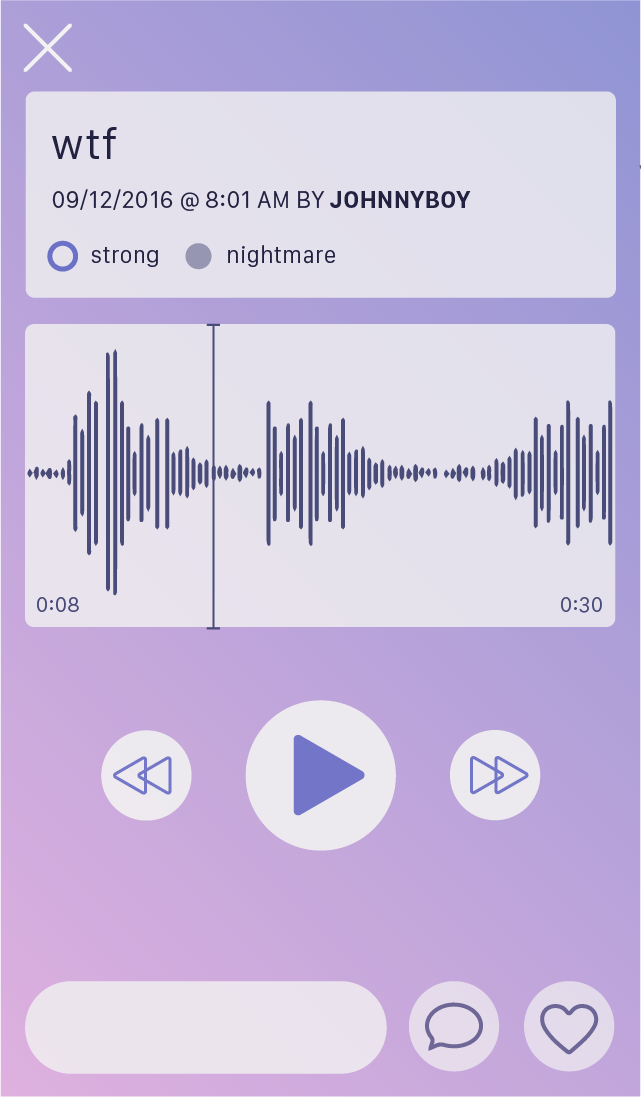
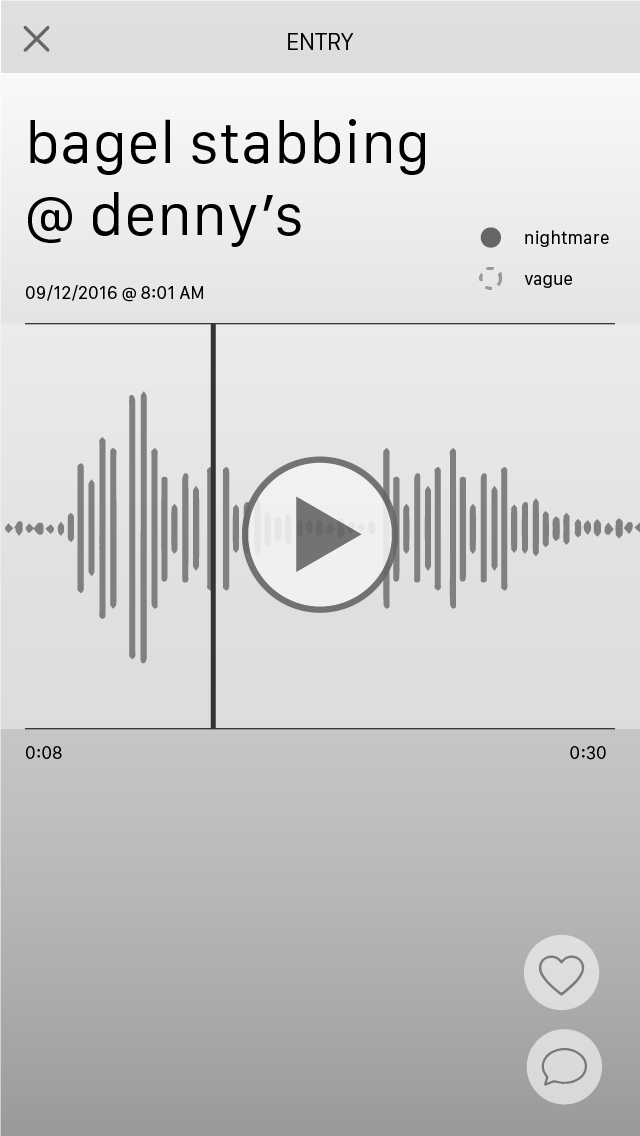
These are dream entries that the user would see after tapping a bubble. They would overlay over the previous screen to make seem quick and easy to access. The legend in the entry was meant to show the user what kind of dream it was, but some users thought they were checkboxes instead.
I meant to let users comment on a dream quickly with the small bar at the bottom, but it just felt unncessary and took up space. Plus, it'd be difficult if the user wanted to see comments first before actually commenting.
Composing entries
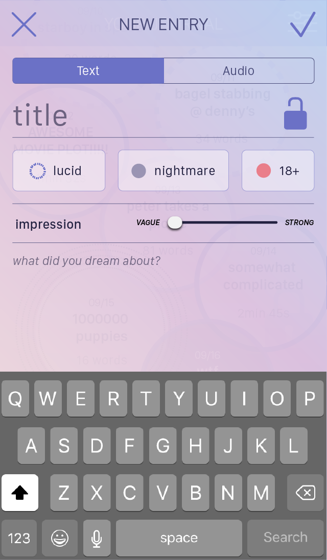
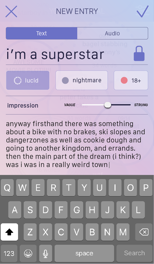

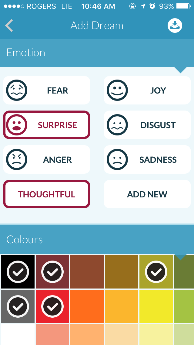
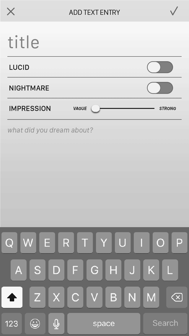
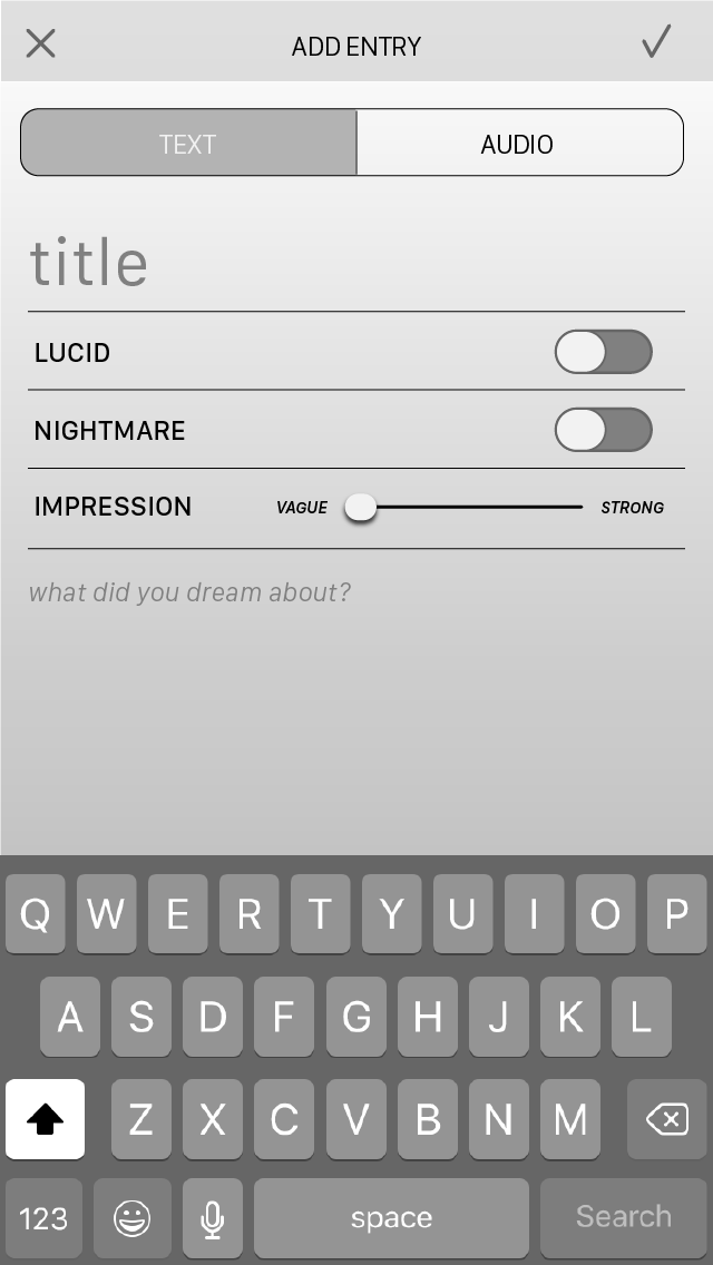
Composing screens were difficult because I couldn't decide where to put the categorization of dreams, or how I should visualize it. I also needed to give the user an option to make an entry private. Generally, I wanted to make creating text and audio entries look visually similiar so the user would know that they're still making a new entry regardless of format.
Other screens

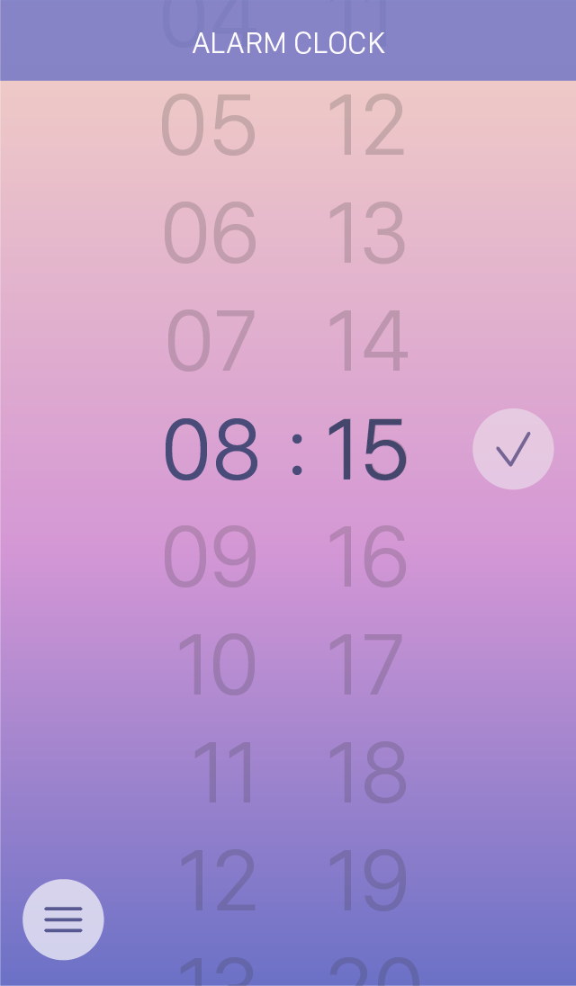
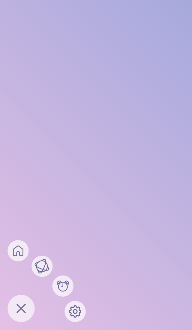
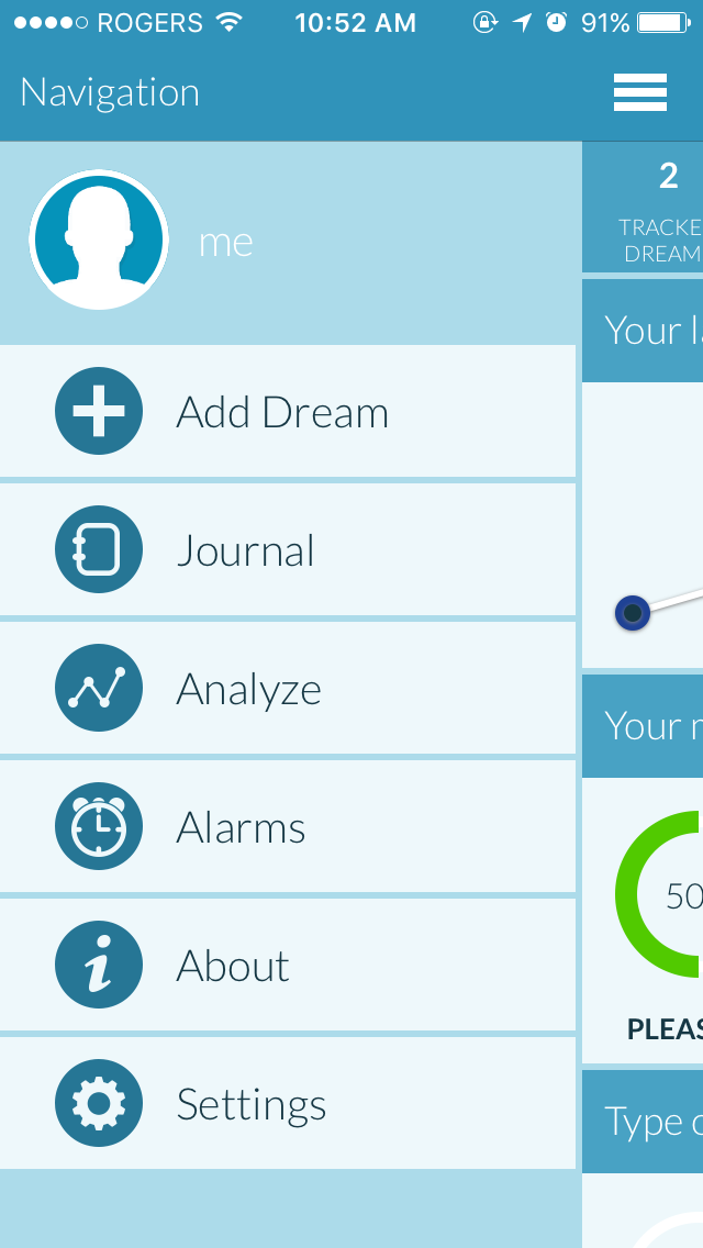
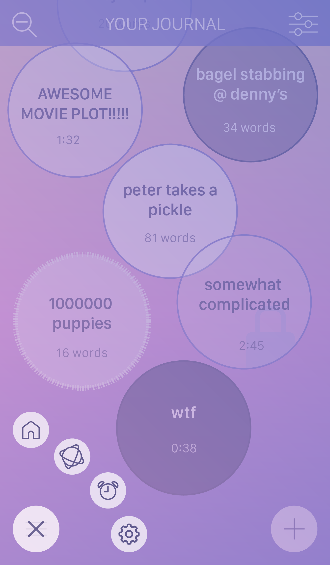
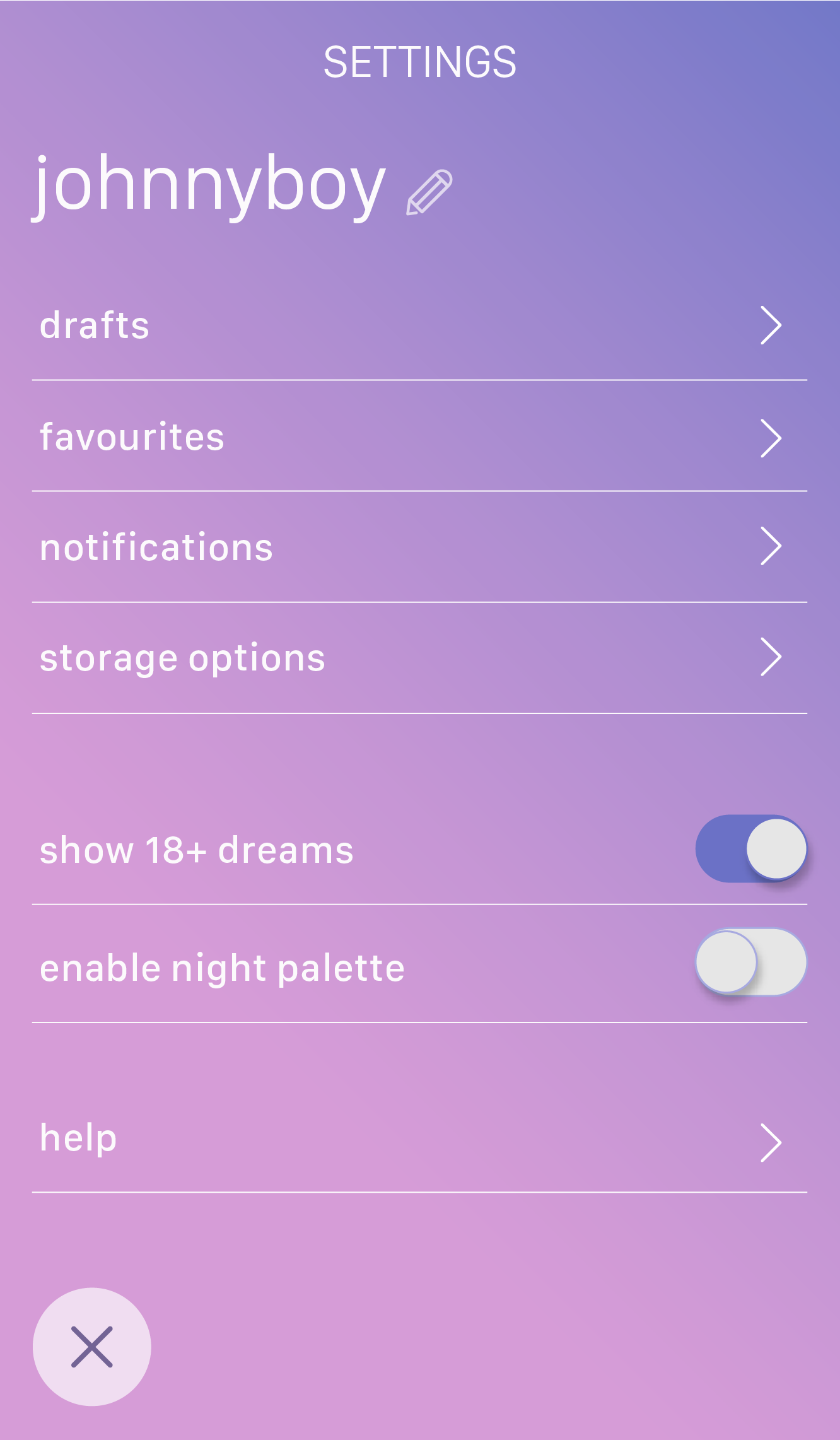
The first screen here is the settings menu, then the alarm clock, and then the actual menu that would pop up when the user presses the menu button on the other screens.
I was recommended to add arrows to menu options in settings to show that it leads somewhere, and also to group the elements better (i.e. switch options should be grouped separate from the other options). Alarm clock was also said to be better named "set alarm" so that users have a choice if they want to record a dream or not. -
Week 8
High fidelity screens and a working prototypeStarting screens
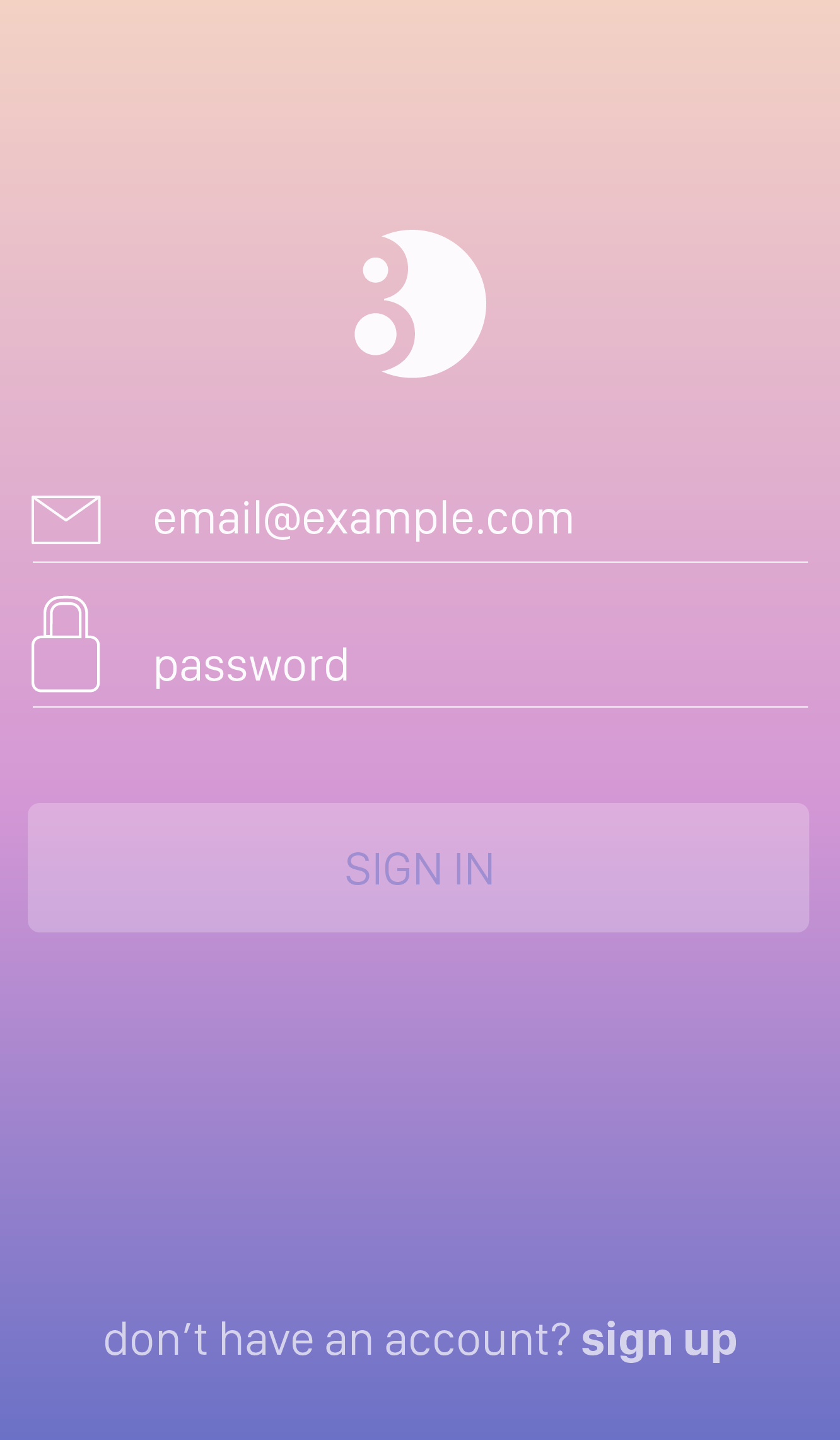
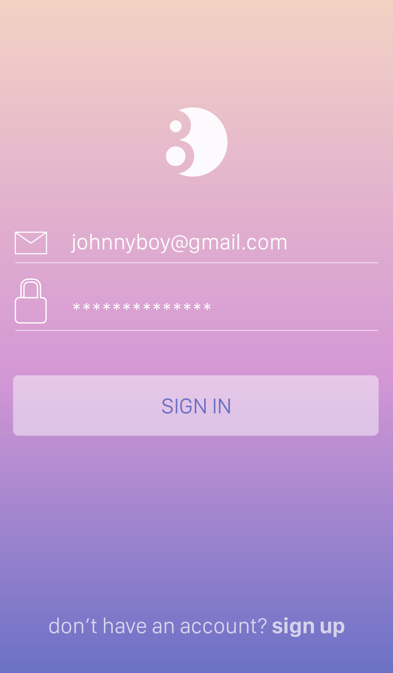
I've decided to create a login screen at first for the user, as it doesn't make much sense to let the user create entries and comment/like without one. I wanted these screens to communicate how a user who hasn't opened the app yet would interact with it (here I cheated a bit because the user already has a login haha).
Journal & Global "Dream Board"
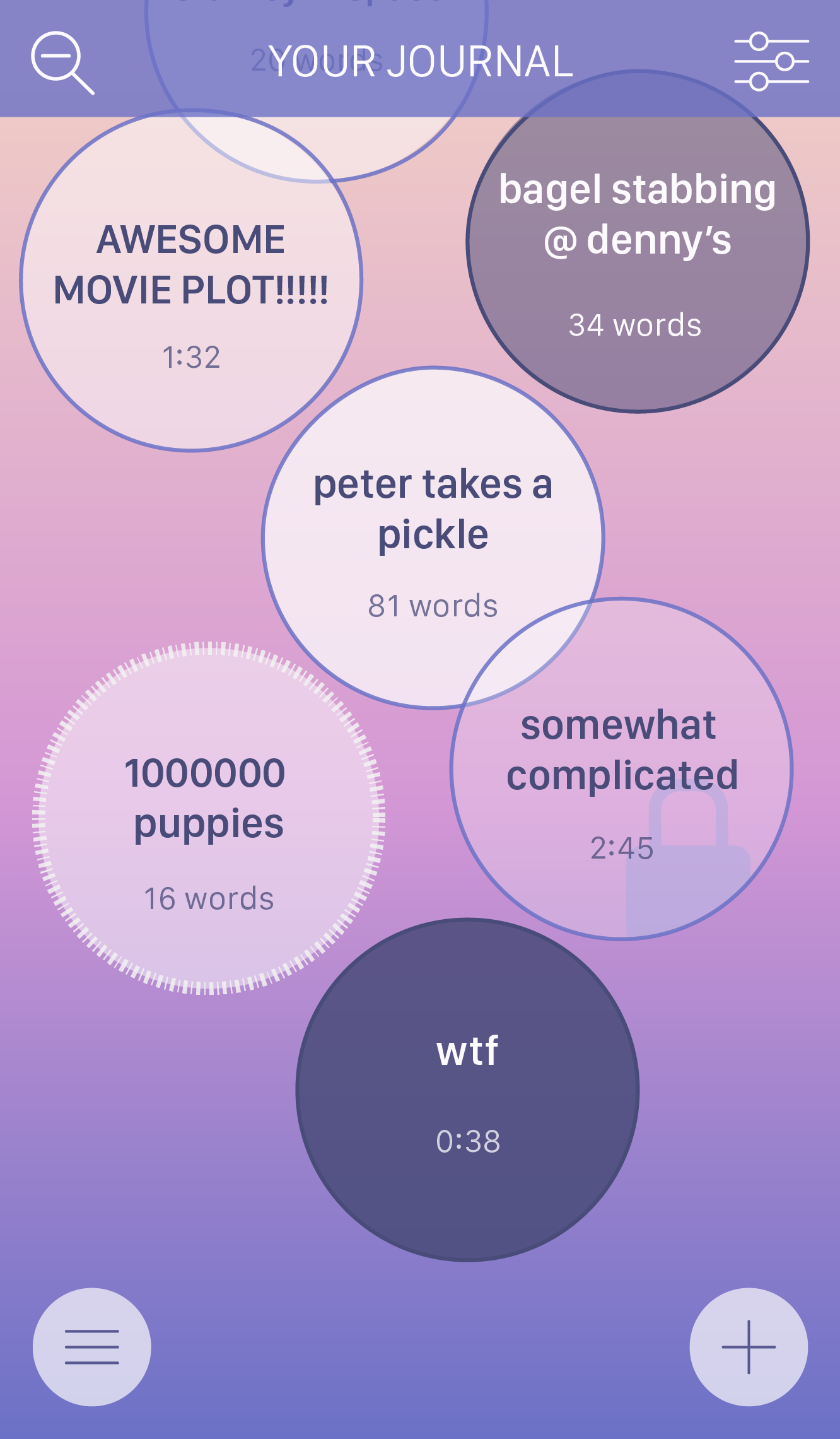
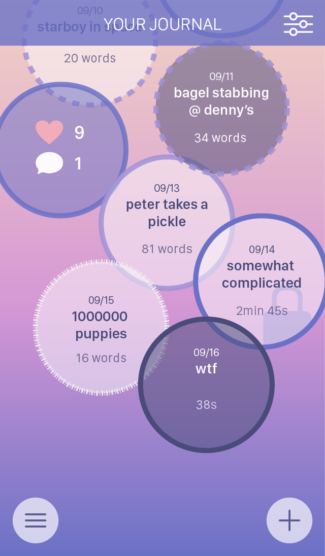
The bubbles representing entries are now cleaner and rely on opacity to communicate the strength of the dream. They still use colour to differentiate types of dreams, except for "lucid" dreams which are special types.
Bubbles that are attached together represent dreams that happen consecutively, so users can tell at a glance how much they've been dreaming at a time. Entries are automatically sorted by date unless specified in the filter option at the top right. You can also see how the menu overlays on the screen when you tap on it here.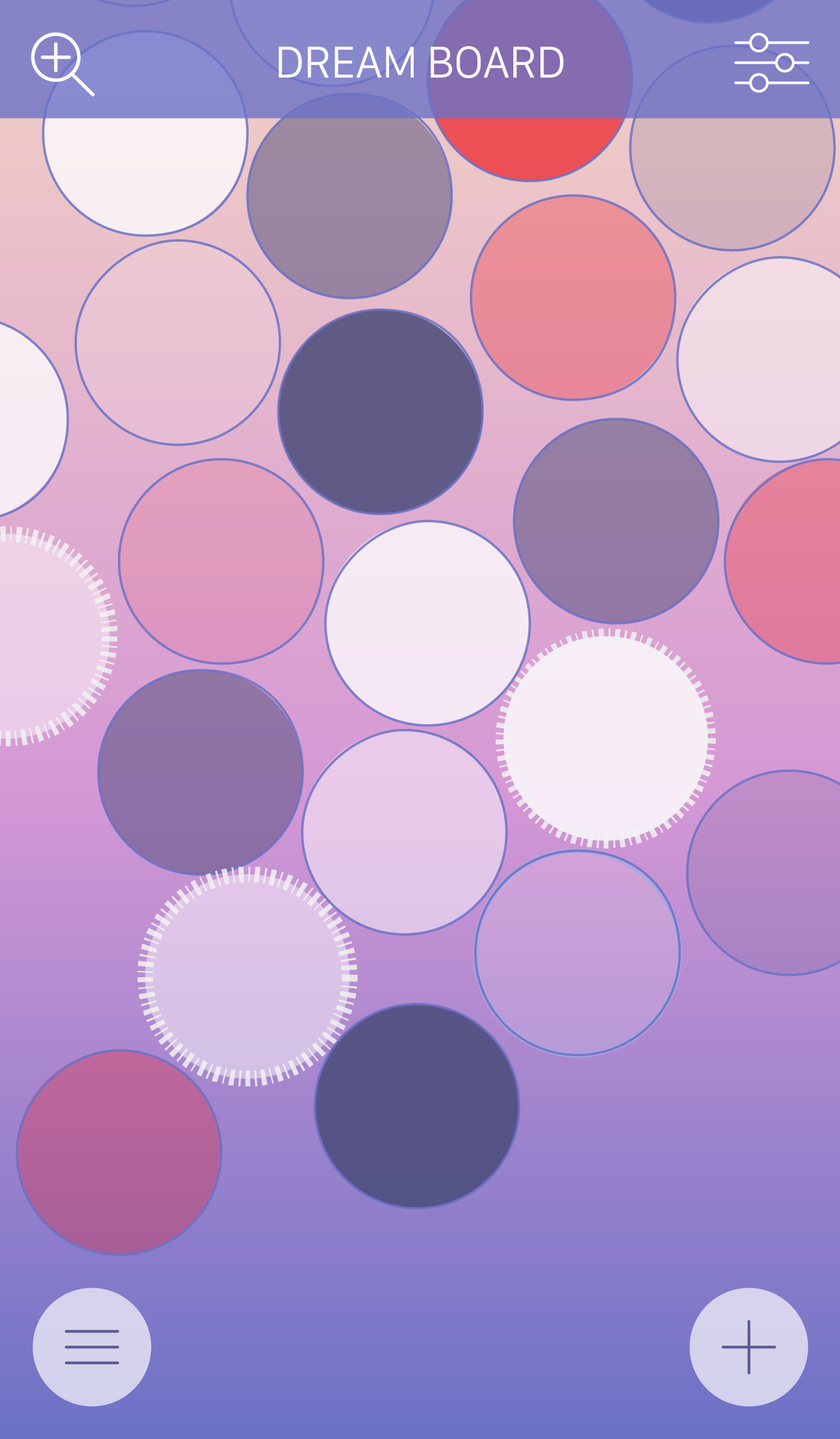
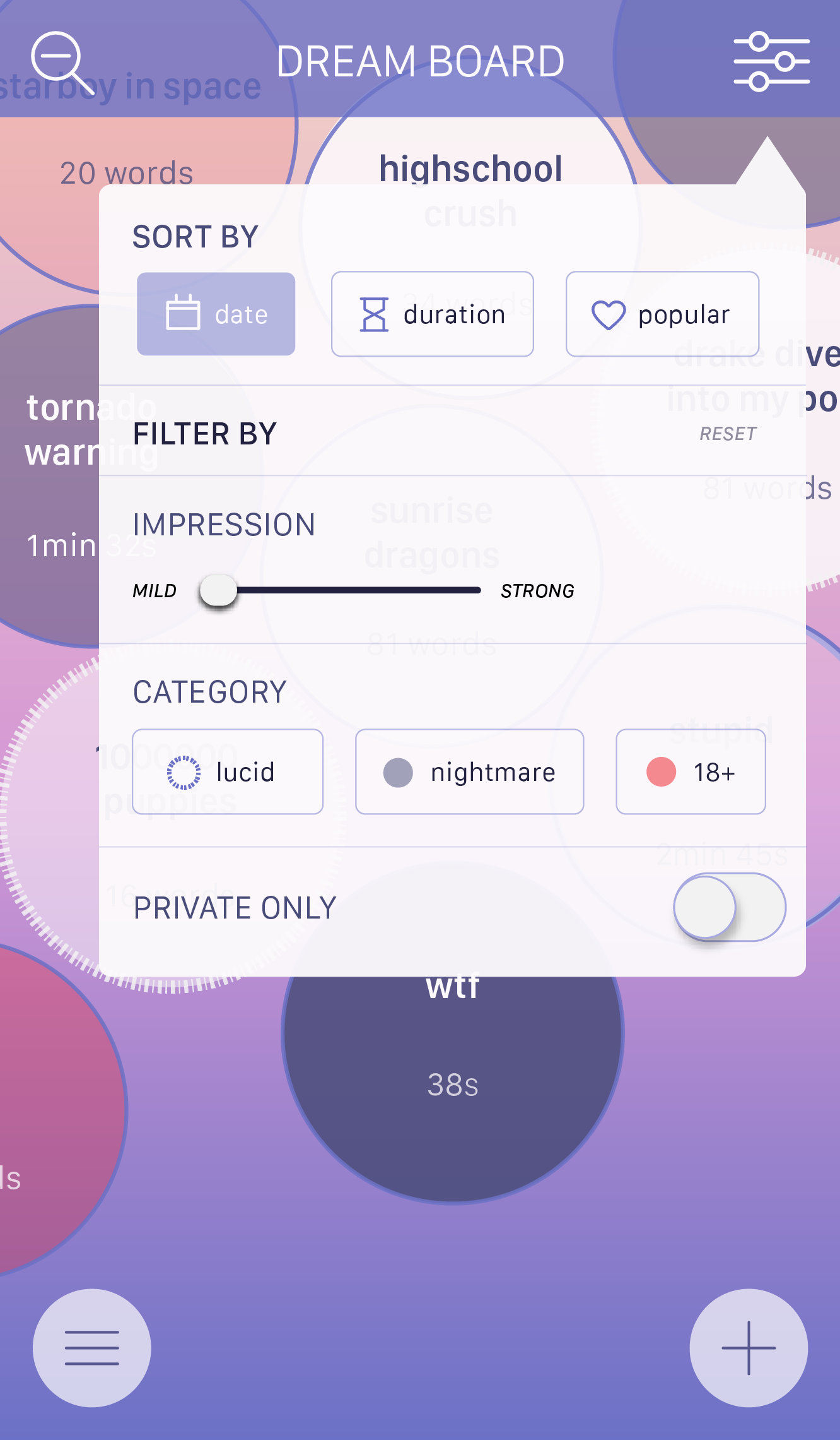
Because there's a lot more space between the bubbles, I wanted to have an option for the user to 'zoom out' to view a more abstract visual of their dreams. This is also applicable in the global dream board screen. This option was made because my main objective, if you refer back to my design brief, was to enable users to "share their dreams with other dreamers in a unique and succinct way." This way, it's very easy to see variety in a user's dreams as a whole.
Entry screens
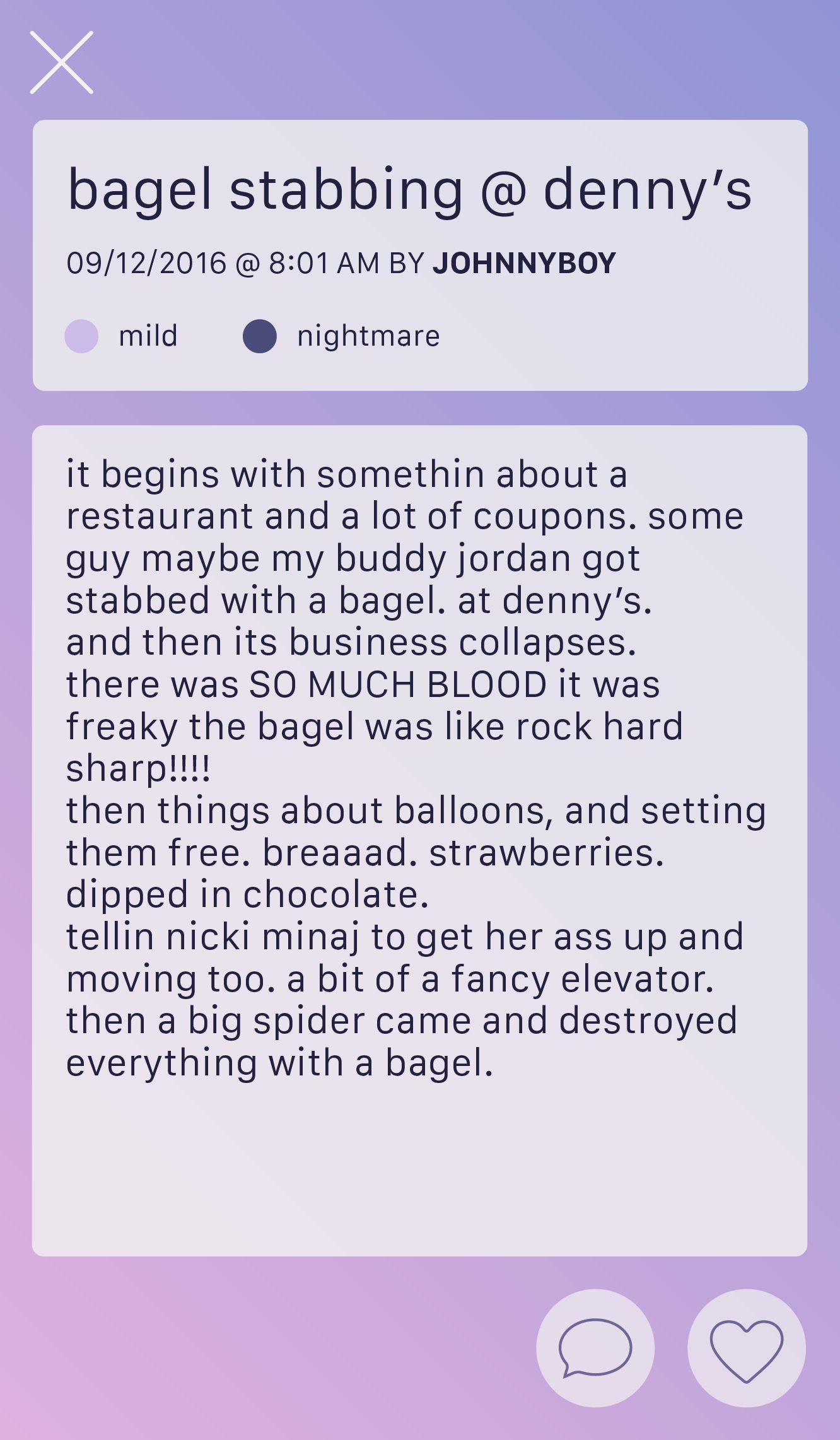

These screens are now much cleaner with the removal of the text bar underneath. The icons are also thinner to match the tone, and I adjusted the playback on audio posts to avoid unncessary clutter. The legend that explains what kind of dream the entry is now relies on the opacity of a different colour instead of an outline to solve the checkbox problem stated last week.
Alarm and Settings screens
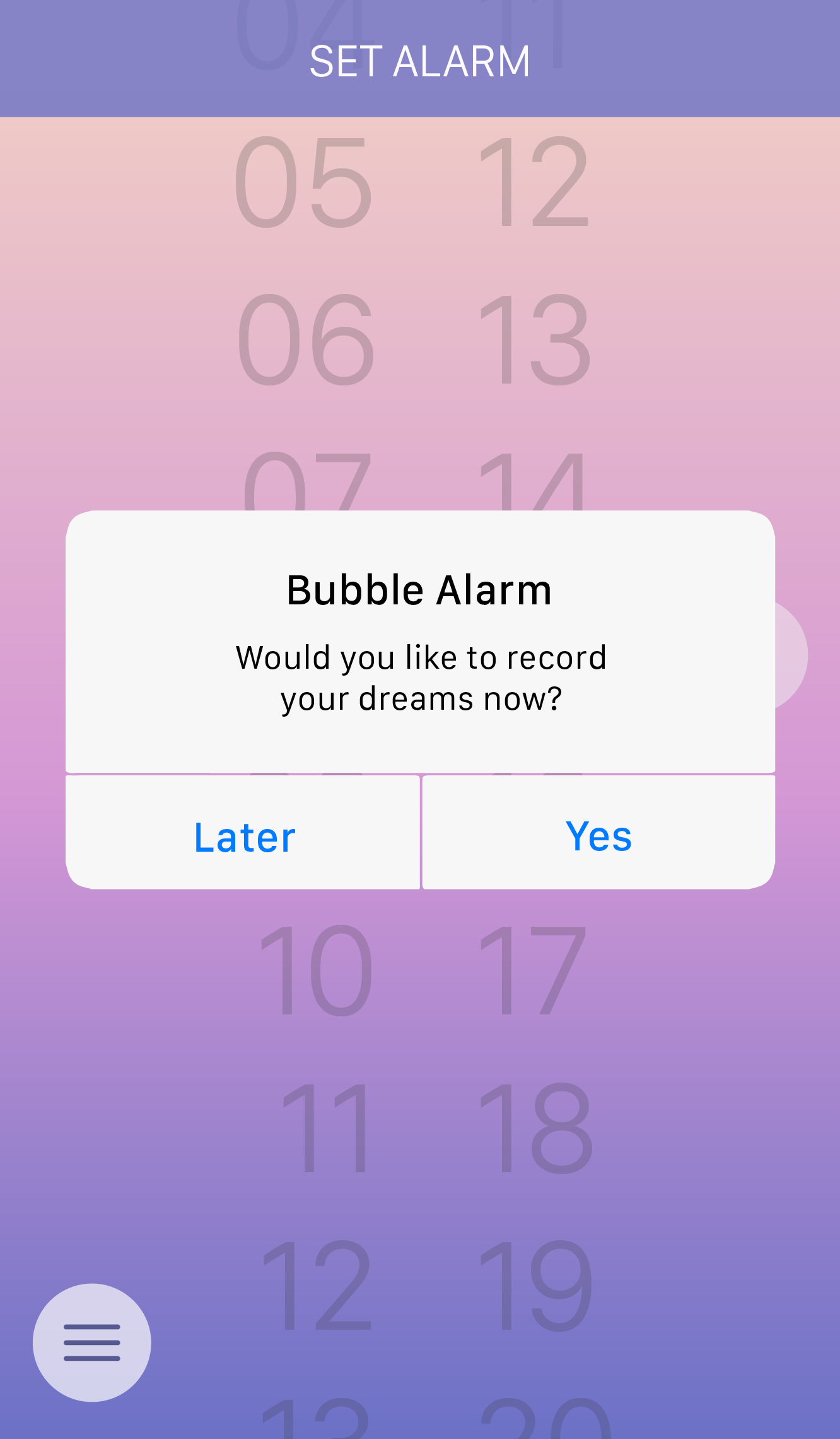
Dialogue is added to show how the alarm works, and settings now have arrows and are grouped properly. These are all the major refinements made for the final deliverables. Note that composing a new entry isn't shown here because they've remained mostly unchanged, so you may view them in the prototype or take a look at last week.
Working prototype
-
Week 9
In progress UI animationsorigami sure is hard.
-
Week 10
Motion UI: one, two, three, four, and fiveScroll & filter
Yes, the screens are touched up and even more refined than before (woo hoo!) because I felt like it was important to make these changes to really communicate what sort of look and feel I wanted this app to give. For example, why not use a gradient as the overlaying top bar instead of a solid rectangle? It blends in better and looks more natural.
Here it shows the way the entries scrolls and the option to be able to show a filter to sort through them. The bubbles are listed with the most recent at the bottom, so it would make sense to scroll upward instead of down.
With a hide/show filter, it enables users to customize what they want to see at the time without taking attention away from the content than if the filter was on screen at all times. Because it's from the top, of course the filtering options will also 'drop down' to make it feel more natural to interact with.
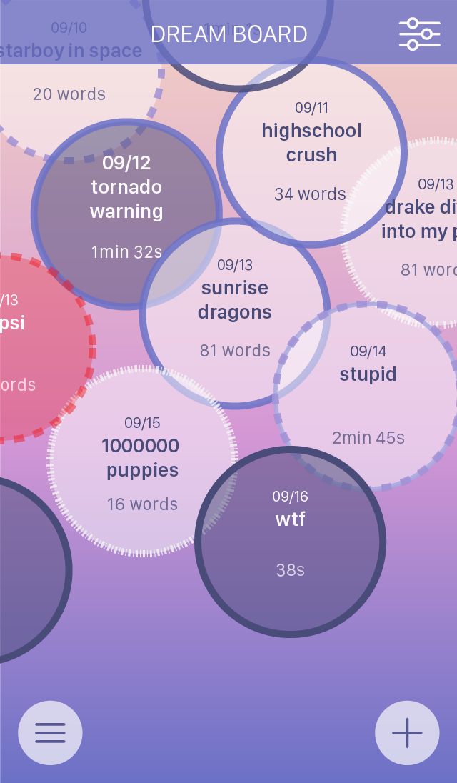
To the Dreamboard
These interactions show the flyout menu and the global Dreamboard. Upon opening the menu, it makes sense to dim the background to let the user focus on where they want to go. I wanted to use a flyout just because it feels like it goes with the theme of the app as opposed to a tab bar. A fun little pop animation really ties the feedback of the tapped menu together.
I also wanted to show the global Dreamboard just because it scrolls side to side. It's to drive home that it's a vast, explorable interface with multiple entries by multiple people as opposed to the user's own dream journal.
Settings
This presents more aspects of customization for the user. Dreams are usually very personal, so in turn the nature of this app is also personal. Letting the user control how they use the app allows them to customize what they like to see. As a result, the app feels more intimate to the user.
The switch animations are also super smooth and really make it feel like you're switching on personal settings.
Peek & read entry
Peek and read is probably one of the more important aspects I wanted to highlight. Enabling the user to quickly glimpse at an entry's details is important in determining whether or not they want to see the full thing. Letting them have a preview also ties into the whole customizing deal. They get to decide what they want to see. The pop up of the peek also shows feedback to their press and hold.
Double tapping, as opposed to single tapping, was used to really make sure the user wanted to see the entry. If they tried to peak at it and didn't really want to read it, they'd have to move their finger away from the bubble first before lifting it up again (otherwise it'll register as a tap, which is pretty useless).
Little animations like the heart filling up and page scrolling to comments are also important feedback cues for the user to really know that what they did was actually done. The share button was added to tie in the native OS look to really bring it together (and of course it'd pop up from the bottom since the buttons are at the bottom).
New entry
New entry was my favourite one to create, because it shows how the user can really customize their entries and make it really specific and personal (selecting entry types or using the slider, for example). Typing of course is intuitive when the text field placeholders are just slightly lighter than regular text. I used a pop up to make it really clear that the user's entry was 'private' once they selected that icon, because if they accidentally selected it, it would be hard to tell since it's a very small change to the icon.
Once they were done with their entry, the older entries were animated to move upward to make room for the new entries just like real bubbles. It just pops right in, tying in the whole bubble theme and making it super clear that a new entry was just added.
Overall, many of the interactions I showed with these are meant to demonstrate the level of customization and feedback users can have with this app.
-
Week 11
Finalizing vision...I'm going to be using this code here as a base template to work off of. Right now it's a little small, so I'm working on making it larger and putting in real content in each section. I don't want to make this as some sort of packaged product but more of an introductory site that explains each primary feature to someone who isn't clear on what this app is about.
-
Week 12
Final vision (site link)Patch notes:
- Increased sizes of all elements for better clarity
- Added elements to destroy the empty voids of space
- Modified responsive parameters
- Changed font family and colours to better fit visuals
- Replaced placeholder text with real content
- Added some flair in the background to tie the concept together
- Added a cursor
Note that each section may glitch out if you go through them too fast, so please proceed with caution.
Improvements if i had more time:
- Really wanted to include the alarm feature, limited time and access to resources didn't let me do this without losing quality of work
- Add an animated gradient background that switched in between colours not only for aesthetic reasons but to show movement and the ethereal core concept of dreams.
Thank you for hanging on throughout everything.
